Initial Publication Date: October 17, 2008
Teaching Geologic Map Interpretation Using Google Earth
Resources in this collection
- A highly effective, non-traditional approach for using Google Earth to teach strike, dip, and geologic map interpretation, with assignments and activities (Barbara Tewksbury, Hamilton College)
- A geologic map interpretation activity for structural geology using Google Earth (Charlie Onasch, Bowling Green State University)
- A collection of fabulous locations in Google Earth for teaching geologic map interpretation.
Google Earth is a terrific resource for teaching geologic map interpretation
- Google Earth satellite images in many places in the world show bedrock with strong, contrasting colors in areas with little vegetation to obscure contacts and unit relationships.
- Imagery is seamless, and, in many areas of the world, the level of detail is amazing.
- Google Earth is free, and students can access Google Earth from their own computers.
What makes Google Earth truly extraordinary for teaching geologic map interpretation is its interactive 3D terrain viewing capability.
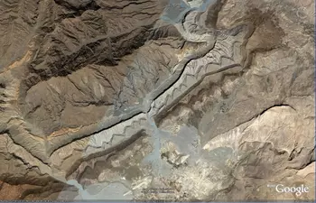
For many students, the vertical view below of eroded and dipping units is little more than a two dimensional pattern of colors. Using tilt, rotate, and zoom in Google Earth, students can see the third dimension with extraordinary clarity, as shown in the Google Earth 3D screen capture at right.The Google Earth image of inclined layers shown at right is practically a geologic map in itself because unit colors are so distinctive. Many beginning structural geology students are flummoxed, however, by the variety of patterns and colors and are unable to even begin to visualize the structure.
Tilting the image and flying through it in Google Earth suddenly makes the structure and relationships obvious to them. Color stripes and zigzags become tilted layers of rock before their very eyes!
The 3D view also helps make it clear what is topographically high and what is topographically low. As illumination direction changes, perception of what is up and what is down changes. At left, the illumination direction for the top image is opposite that for the bottom image. To most people, the dark red unit looks lower on the top image and higher on the bottom image (although it may be just the opposite for you!). The 3D view, however, helps students see that the red unit is at lower elevations than the pale pink unit.


