How do I use Semi-log or Log-Log plots?
Understanding non-linear relationships in the Earth sciences
This module is undergoing classroom implementation with the Math Your Earth Science Majors Need project. The module is available for public use, but it will likely be revised after classroom testing.
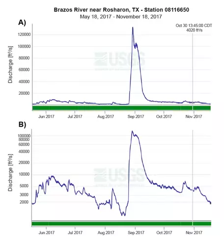
Brazos River discharge from May to November, 2017 in Linear (A) and Log scale (B). Data from the USGS water data repository.
![[reuse info]](/images/information_16.png)
Provenance: Kyle Fredrick, Pennsylvania Western University - California; Ann Mariam Thomas, Northwestern University
Reuse: This item is in the public domain and maybe reused freely without restriction.
An introduction to using Semi-log or Log-log plots
In many aspects of Earth and Environmental science, we work with data related to vast scales of time and space. We also study systems with complex interactions measured on vastly different scales. For example, the geologic timescale covers nearly 5 billion years, while our understanding of modern climate change spans barely 100 years. When scientists (or science students) collect data, they often use graphs to visualize system interactions or trends. Dealing with large (or very small) scales graphically poses unique challenges. Think of a standard x-y plot where you might plot some variable as it changes in time. But what happens if your variable changes from a value of 2 units to 20,000 units within just a few hours?
For example, take a look at the graphs for the Brazos River near Houston, Texas, with stream flow (discharge) on the y-axis and time on the x-axis. In this example, discharge is measured in cubic feet per second (cfs), captured in 15-minute intervals for a six-month period from May to November 2017.
Both of these graphs show the same data, with the upper graph a normal x-y plot of discharge vs. time, but the lower graph displays discharge on a logarithmic scale. Notice how the height of the large peak in August 2017 changes the y-axis. The effect is that the data prior to that event is barely visible in comparison. In fact, that peak represents the landfall of Hurricane Harvey, one of the most devastating flood events in Texas history!
The lower graph is known as a "Semi-log" plot, where one axis is log scale and the other is linear. On a log scale, the values count in multipliers of 10, representing values on a log10 scale, or 100 (=1), 101(=10), 102(=100), and so on.
When do I use Semi-log plots?
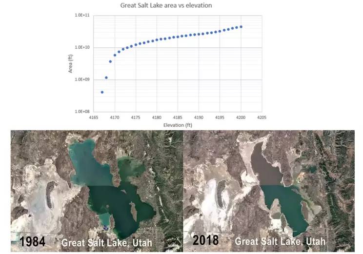
Photo of change in area distribution of Great Salt Lake from 1984 to 2018. Graph of area vs elevation in 2023.
![[creative commons]](/images/creativecommons_16.png)
Provenance: Image from Benjamin Burger, June 10, 2020; downloaded from Wikimedia Creative Commons.
Reuse: This item is offered under a Creative Commons Attribution-NonCommercial-ShareAlike license http://creativecommons.org/licenses/by-nc-sa/3.0/ You may reuse this item for non-commercial purposes as long as you provide attribution and offer any derivative works under a similar license.
Semi-log graphs are especially helpful when data includes variables that change at different scales of time or space. In the Earth sciences, you may hear the term
orders of magnitudeThe value of the exponent based on multiples of 10 to describe how a variable or effect may change or the spread of data when considered on the whole. If we graph two variables against each other, one that changes "exponentially" and another that changes "normally," for example, the exponential data would create an especially long axis compared to the normal, making reading and analyzing the graph nearly impossible.
For example, consider the evaporation of the Great Salt Lake in Utah. Since 1875, the DEPTH of the lake has dropped approximately 6 meters while the AREA of the lake has decreased by over 6 billion square meters! Scientists and local residents are certainly concerned about the lake's continued shrinkage, so understanding the relationship between water loss and area is critically important. To model the likely change in area with depth, USGS workers measure the Great Salt Lake area (ft) vs. elevation (ft), which is shown on the graph for 2023. Notice the elevation changes by 33 ft and the area changes by 44,000,000,000 ft.
When do I use Log-log plots?
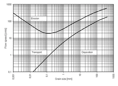
Traditional diagram for grain size mobility in a current.
Provenance: Uploaded to Wikimedia by Karrack on October 25, 2009.
Reuse: This item is offered under a Creative Commons Attribution-NonCommercial-ShareAlike license http://creativecommons.org/licenses/by-nc-sa/3.0/ You may reuse this item for non-commercial purposes as long as you provide attribution and offer any derivative works under a similar license.
Log-log graphs are based on the same principle as semi-log graphs, except that both variables may change values over large ranges. For example, consider the Hjulström Diagram, shown below. It is a graphical representation of the mobility of sediments in a current. The axes are grain size, commonly in millimeters, and current velocity in centimeters per second. Grain size can range from large boulders a meter or more across to the fine clay, just fractions of a millimeter in scale. Current velocity can be placid, nearly still water (approaching zero cm/s) to torrential floodwaters at many meters per second.
How do I read Log scales?
In order to read or plot data on a log scale, it is critical to recognize what the grid lines represent. The main thing to recognize is that on a linear, or normal, scale, the values will be evenly spaced. But on a log scale, the values are "stretched," so that the distance between, 1 and 2 is larger than the distance between 9 and 10. On a semi-log plot, that may be the x- or y-axis. On a log-log plot, both axes have this feature. Remember, the log scale is counting up 100, 101, 102, etc.
Let's try some examples
For the subsequent examples, it is advisable to use a spreadsheet program like Microsoft Excel. The examples and the
Practice Problems refer to Excel and assume users of this page have a basic understanding of Excel's functionality. Semi-log and log-log graph paper is available to allow you to complete these by hand, but if you are using this module, it is likely your instructor wants you to become familiar with, or even proficient at, Excel or a comparable program.
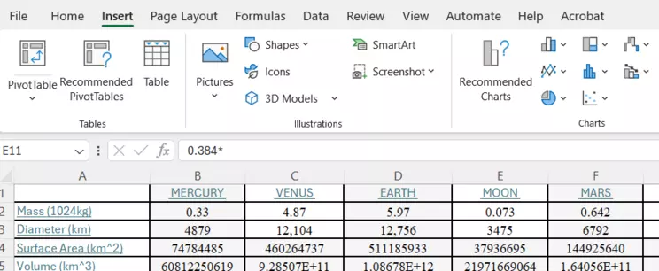
Example 1: Volume of celestial bodies
Below is a table of the physical characteristics of planets within our Solar System and Earth's moon (Williams, D., NASA, 2024). Plot the values of volume against the diameter for each. Determine the relationship, in the form of an equation, between diameter and volume. Based on these data, if a planet were discovered in a distant system with a diameter of 75,000 km, what would the volume be for the planet?
| Planet |
Mercury |
Venus |
Earth |
Moon |
Mars |
Jupiter |
Saturn |
Uranus |
Neptune |
Pluto |
| Diameter(km) |
4879 |
12,104 |
12,756 |
3475 |
6792 |
142,984 |
120,536 |
51,118 |
49,528 |
2376 |
| Volume (km3) |
6.08E+10 |
9.29E+11 |
1.09E+12 |
2.20E+10 |
1.64E+11 |
1.53E+15 |
9.17E+14 |
6.99E+13 |
6.36E+13 |
7.02E+9 |
Step 1. EVALUATE the data to assess the ranges of the variables.
Taking a moment to consider the data before diving in to plotting it may help determine how to set up your graph. In this example, the diameter of the planets ranges from under 5,000 kilometers to almost 150,000 kilometers. While that is not a huge difference, at only three orders of magnitude, it still would be difficult to visualize on a linear axis. With regard to volume, the range is from over 10 billion cubic kilometers to over 15 quadrillion cubic kilometers! That is almost seven orders of magnitude. With both of these variable ranges, it is likely that a log-log plot will work best. To demonstrate the point, take a look at the image of a blank graph included here. The x-axis shows 1,000 to 1,000,000 km in standard form, while the y-axis has 109 to 1016 in scientific notation format of 1E+9. This is shorthand in Excel for 1.0 x 10⁹, or 1 billion.
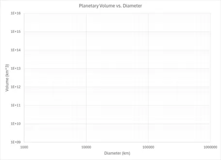
Blank graph for log-log plot.
Provenance: Kyle Fredrick, Pennsylvania Western University
Reuse: This item is in the public domain and maybe reused freely without restriction.
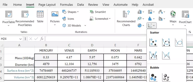
Step 2. CREATE an x-y scatter plot of the data.
Using a spreadsheet program (Excel, Google Sheets, etc.) with your data in tabular form, you can create a graph. For our purposes, we'll be using Excel for all our examples.
Under the Insert tab in Excel, you'll see the x-y scatter plot option. This is the most common plotting tool for the Earth Sciences when analyzing data. Plot the diameter of the planets on the x-axis and the volume on the y-axis.
Screenshot for Inserting a Chart
Provenance: Kyle Fredrick, Pennsylvania Western University
Reuse: This item is in the public domain and maybe reused freely without restriction.
From here, there are a lot of steps in Excel to actually create a final graph. If you've not used Excel much, follow along with the screenshots.
This sequence of steps demonstrates how to make the y-axis logarithmic. The procedure is the same for the x-axis!
Screenshot to insert a Scatter plot
Provenance: Kyle Fredrick, Pennsylvania Western University
Reuse: This item is in the public domain and maybe reused freely without restriction.
Generally, it is best to start with a scatter plot without the connecting lines. That is the first option, shown here.
Scatter plot chosen with blank chart showing
Provenance: Kyle Fredrick, Pennsylvania Western University
Reuse: This item is in the public domain and maybe reused freely without restriction.
This one opened with no data. In the toolbar above, click on Select Data.
Select Data window
Provenance: Kyle Fredrick, Pennsylvania Western University
Reuse: This item is in the public domain and maybe reused freely without restriction.
This is the Select Data window. Choose the button to Add in the options.
Add Data window for Edit Series
Provenance: Kyle Fredrick, Pennsylvania Western University
Reuse: This item is in the public domain and maybe reused freely without restriction.
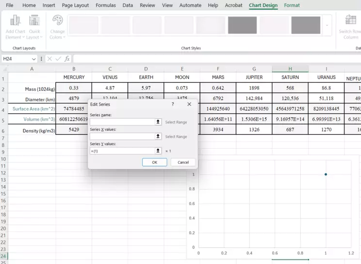
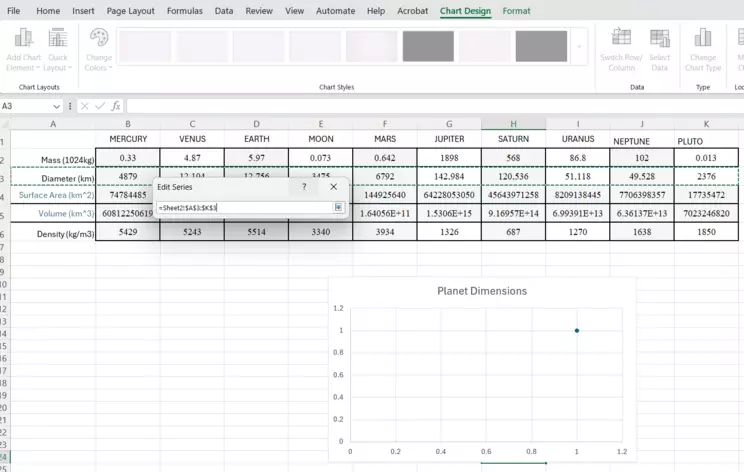
This is the Edit Series window. The first box allows you to add a title for the "Series," which will become the title of the Chart. The x- and y-axes boxes follow and are called "Series X values" and "Series Y values." Note the icon at the end of those boxes. That is what you can click, and it will allow you to choose the data to plot on each axis.
Choose X-axis data from Series X Values tool.
Provenance: Kyle Fredrick, Pennsylvania Western University
Reuse: This item is in the public domain and maybe reused freely without restriction.
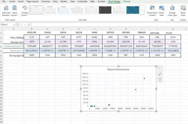
Note the chart has a title "Planet Dimensions," which is what was typed into the Series Name box. Note that the Diameter cells (row 3 in this example) is outlined in a green dashed line. That indicates the cells you've included. For demonstration purposes, we've included the first column where is reads "Diameter (km)." However, you do NOT want to include the row headings when you select your data. Start with the first value and go from there. When you've chosen the cells, click the icon at the end of the line again, and it will get you back to the Edit Series window. You choose your x- and y- data to complete this window, then click OK.
Data is now selected, Diameter vs. Volume
Provenance: Kyle Fredrick, Pennsylvania Western University
Reuse: This item is in the public domain and maybe reused freely without restriction.
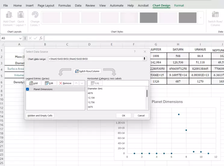
You are back to the Select Data window. In the background, you should see the chart is now populated with data points for the planets. Notice how Excel has set the axes for you. This is both helpful, but also can be problematic, and is where you have to be proficient enough to recognize the difference between the software default and what you actually need. Click OK to finish this window.
Raw chart, with a right-click to show options
Provenance: Kyle Fredrick, Pennsylvania Western University
Reuse: This item is in the public domain and maybe reused freely without restriction.
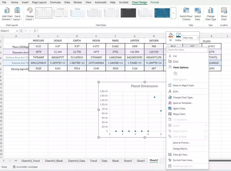
This is the default version of the chart. We've right-clicked on the chart area to show the many options available to get started manipulating and customizing it. For example, it may be preferable to move the chart to its own sheet, which you can do from this right-click menu OR you can do from the toolbar above indicated by "Move Chart." For now, we'll just work with it here in the data page.
Screenshot of raw chart in the data page
Provenance: Kyle Fredrick, Pennsylvania Western University
Reuse: This item is in the public domain and maybe reused freely without restriction.
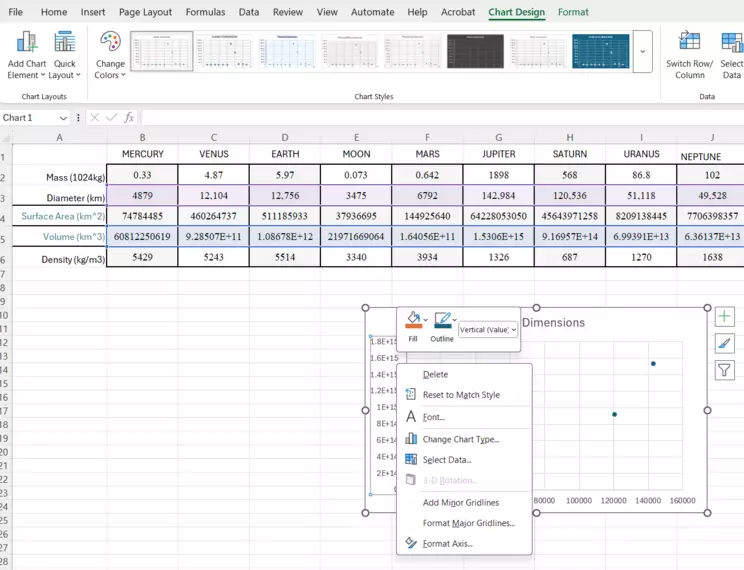
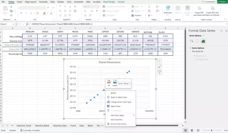
This is the correct, raw version of the chart. Notice the axes as well as the data source above. The data is tinted purple (Diameter) and blue (Volume). Hover over the y-axis (Volume) and right click on "Format Axis." We're going to make it logarithmic!
Format Axis window
Provenance: Kyle Fredrick, Pennsylvania Western University
Reuse: This item is in the public domain and maybe reused freely without restriction.
When you've right-clicked on the y-axis to see this menu, choose the "Format Axis" option at the bottom. We're going to make the y-axis logarithmic! You can repeat these instructions to do the same for the x-axis.
Format Axis window and options
Provenance: Kyle Fredrick, Pennsylvania Western University
Reuse: This item is in the public domain and maybe reused freely without restriction.
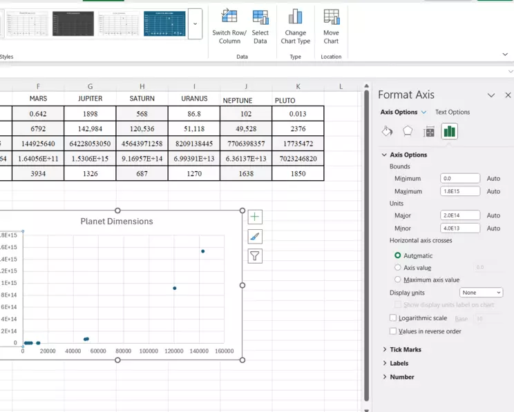
You should see the "Format Axis" window open to the right. Near the bottom, there is a radio button to select to make the axis logarithmic, called "Logarithmic Scale." Choose this option and a "base" option opens. For our purposes, we'll leave that as 10. And in most cases, that is what you'll want to do.
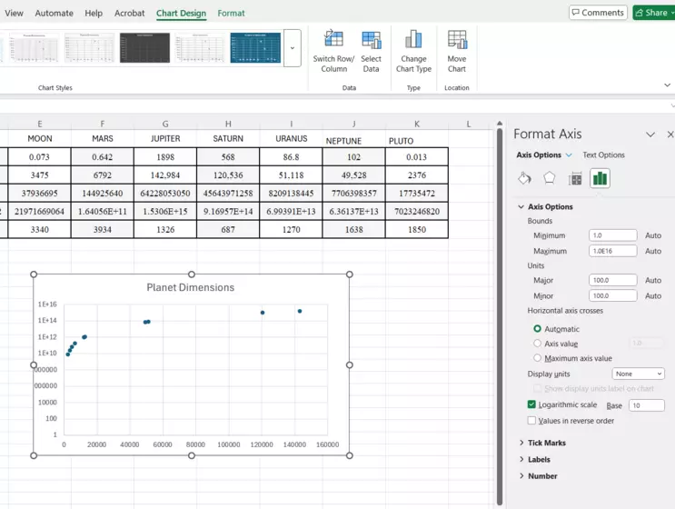
Chart with Logarithmic X-axis
Provenance: Kyle Fredrick, Pennsylvania Western University
Reuse: This item is in the public domain and maybe reused freely without restriction.
Now you can see how the data points have been raised up into the upper part of the y-axis scale! Keeping open the "Format Axis" window, you can use the Bounds choices to change the scale, and in this case, stretch it a bit. We'll set the lower bound (Minimum) at 1.0E9, the equivalent of 1 x 10^9 or 1 billion cubic kilometers, since none of the planets are less than that.
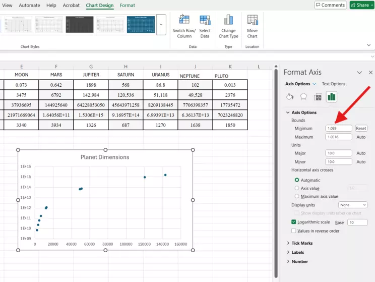
Log Axis is corrected for new lower bound
Provenance: Kyle Fredrick, Pennsylvania Western University
Reuse: This item is in the public domain and maybe reused freely without restriction.
The graph should be looking a lot better now. At this point, you can replicate the steps above to make the x-axis logarithmic, for our final Log-log plot. Or, you can follow along to see what this looks like as a Semi-log example. You can spend some time modifying the chart for esthetics, which you'll find when you are working in the chart and have the Chart Design tab available.
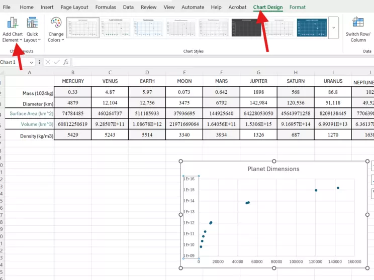
Chart Design tab and options
Provenance: Kyle Fredrick, Pennsylvania Western University - California
Reuse: This item is in the public domain and maybe reused freely without restriction.
The Chart Design tab (long arrow) allows for you to add some technical and aesthetic items to your graph (short arrow), such as Axes labels, legends, etc. It is best to include labels for your axes to be clear about what the graph is showing.
Final Chart before adding a trendline
Provenance: Kyle Fredrick, Pennsylvania Western University
Reuse: This item is in the public domain and maybe reused freely without restriction.
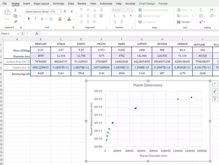
Here is the chart showing axes labels. Notice the font for the axes has been increased to make it more visible. We've also added minor gridlines to the y-axis using the Format Axis dropdown menu.
Final with Y AND X as log
Provenance: Kyle Fredrick, Pennsylvania Western University
Reuse: This item is in the public domain and maybe reused freely without restriction.
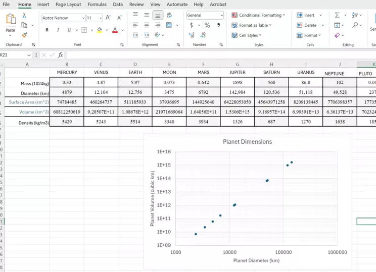
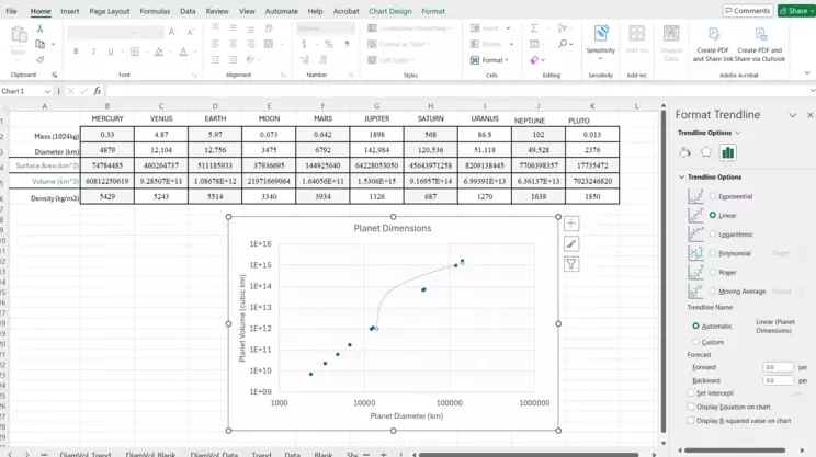
In the image here, you'll see that the x-axis has now been converted to Logarithmic, with the minimum set to 1000. This is the graph we'll refer to for the rest of this example. The next steps are related to the Step 3: Adding a Trendline section!
Otherwise, you can move on below.
*As a side note, other chart types may be useful in select cases for analysis, while others are especially relevant for display and communicating results.
Be sure to properly label your axes! The default in Excel is a standard, linear axial scale. To change one or both of the axes to logarithmic, right-click on the axis in question and choose "Axis options." In the Axis tool that appears in the window to the right, there is a radio button to change to logarithmic (default base 10).
Below is the same graph from above, except the data has been included.
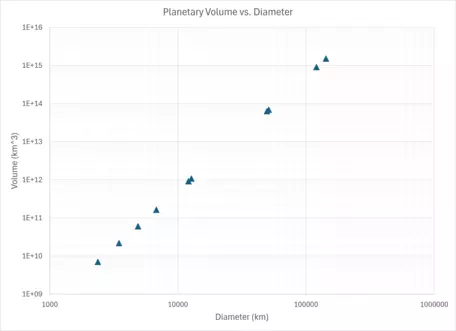
Graph with data points of Volume vs. Diamater of planets.
Provenance: Kyle Fredrick, Pennsylvania Western University
Reuse: This item is in the public domain and maybe reused freely without restriction.

A graph of Planetary Volume vs. Diameter on standard x-y axes, without Log.
Provenance: Kyle Fredrick, Pennsylvania Western University
Reuse: This item is in the public domain and maybe reused freely without restriction.
If we don't alter the axes and just use a standard plot, the graph is not very useful! Look at what happens to the smaller planets. They plot so near the x-axis, that their volume is nearly indistinguishable. But Saturn and Jupiter fall within the graph area because they are so much larger.
Step 3. Add a TRENDLINE to the graph.
Clearly, there is a relationship between planetary diameter and volume. But, to use this data for predicting unknown values, we need to add a trendline to the graph, also known as a "line of best fit." The trendline is the graphical view of an equation, which is effectively a mathematical model of the relationship between the variables.
As above, if you've not used Excel much, here is a sequence that gives screenshots and much more detail for adding a trendline.
Final with Y AND X as log
Provenance: Kyle Fredrick, Pennsylvania Western University
Reuse: This item is in the public domain and maybe reused freely without restriction.
Starting with our "finished" plot of Volume vs. Diameter, we can add a trendline to the data.
Right-click menu for Data Series
Provenance: Kyle Fredrick, Pennsylvania Western University
Reuse: This item is in the public domain and maybe reused freely without restriction.
Within the chart area, hover over one of the data points and right-click. You'll see the Format Data Series window open on the right. Within the right-click dropdown menu, select "Add Trendline."
Default linear trendline with menu
Provenance: Kyle Fredrick, Pennsylvania Western University
Reuse: This item is in the public domain and maybe reused freely without restriction.
Once you've selected to "Add Trendline," it will automatically place a dashed, linear function on your graph. It is pretty clear that for this graph, that linear trend does NOT match the data. Notice in the Format Trendline window, there are choices that you can make to alter the function of the trendline. Click the radio buttons to see how the other trendlines would look.
Power Trendline option
Provenance: Kyle Fredrick, Pennsylvania Western University
Reuse: This item is in the public domain and maybe reused freely without restriction.
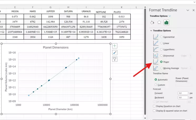
In this case, the Power trendline is the clear winner, matching up very well with the data. Next, at the bottom of the Trendline Options, choose to Display Equation on chart.
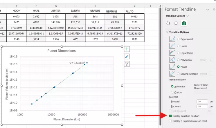
Trendline with Equation
Provenance: Kyle Fredrick, Pennsylvania Western University
Reuse: This item is in the public domain and maybe reused freely without restriction.
The equation is the mathematical function of the line that best fits the data. This allows you to extrapolate and interpolate along the line where you DON'T have data. Note the equation is included on the chart near the trendline. You can highlight that and edit the font to make it more visible.
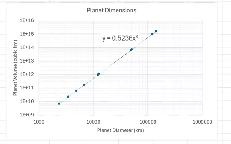
Final Log-log Plot with Trendline and Equation
Provenance: Kyle Fredrick, Pennsylvania Western University
Reuse: This item is in the public domain and maybe reused freely without restriction.
Our plot of planetary volume to diameter gave us an equation of
$y=0.5236x^3$! We can use this equation to evaluate other spatial bodies within and outside of our Solar System!
Or, if you are comfortable with Excel, you may move on here.
Right-click on the data points in the Excel graph. A window will appear where you can choose to "Add Trendline." On the right side of the window, the trendline tool will open where you can choose what type of function best represents the data. There are several options, with radio buttons that allow you to try them out. In this case, a visual assessment of which of these functions "fits best" shows that "Power" is the right one. Note how all the data points are more or less on the trendline. Below the functions in the same window, click the radio button to add the equation. The equation will appear on the graph near the trendline.
Remember that planets are generally considered spherical. The relationship of the volume (v) and diameter (d) of a sphere can be described by a polynomial equation like $v = a * d^3$. Now, estimate the value of "a" to fit the data on the graph.
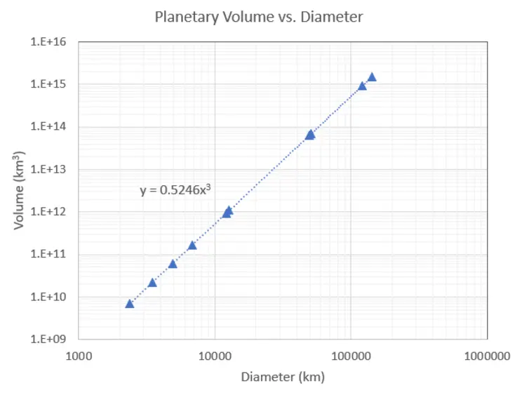
Data plot of planetary Volume vs. Diameter with trendline and equation.
Provenance: Kyle Fredrick, Pennsylvania Western University
Reuse: This item is in the public domain and maybe reused freely without restriction.
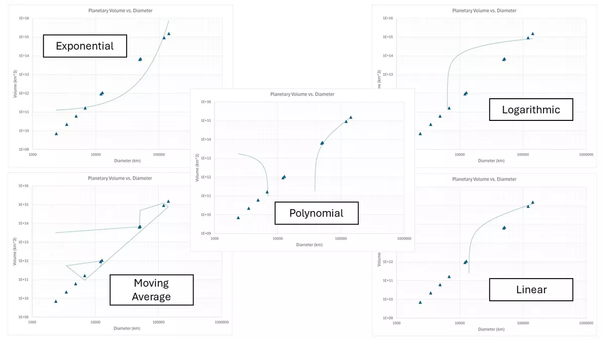
Other trendline options for planetary Volume vs. Diameter...ALL BAD, in this case.
Provenance: Kyle Fredrick, Pennsylvania Western University
Reuse: This item is in the public domain and maybe reused freely without restriction.
Step 4. ANALYZE the graph to determine the relationship between variables.
To determine the volume of our hypothetical planet, we can now use the equation from Excel that corresponds to our line of best fit.
The equation was given as $y = 0.5246x^3$
So the volume (y), based on the diameter (x) would be `V = 0.5246 * (75","000 km)^3`
`V = 2.21xx10^(14) km^3` or `V = 2.21 E14 km^3`
Does that match up with the trendline on the graph?
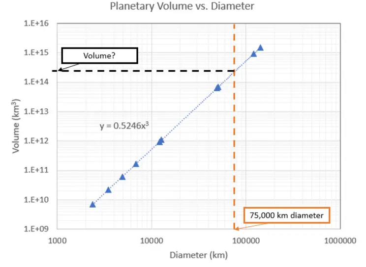
An annotated graph showing the solution.
Provenance: Kyle Fredrick, Pennsylvania Western University
Reuse: This item is in the public domain and maybe reused freely without restriction.
Example 2: Decay of radioactive isotopes
Below is a table of tritium level (in TU) of groundwater vs. the number of half-lives recharged from precipitation in 1963 in the Bismarck area in North Dakota. Plot the values of tritium concentration against the number of half-lives. Determine the relationship, in the form of an equation, between tritium concentration and the number of half-lives. Based on this data, if the natural background level of tritium in groundwater is below 5 TU in this area, how long or how many half-lives does it take for the tritium level of groundwater to fall back to the natural background level?
| Tritium Concentration (TU) |
No. of Half-lives |
| 4370 |
0 |
| 2185 |
1 |
| 1093 |
2 |
| 546 |
3 |
| 273 |
4 |
| 137 |
5 |
| 68 |
6 |
| 34 |
7 |
| 17 |
8 |
Step 1. EVALUATE the data to assess the ranges of the variables.
Provenance: Yongli Gao, University of Texas at San Antonio
Reuse: This item is offered under a Creative Commons Attribution-NonCommercial-ShareAlike license http://creativecommons.org/licenses/by-nc-sa/3.0/ You may reuse this item for non-commercial purposes as long as you provide attribution and offer any derivative works under a similar license.
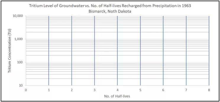
Taking a moment to consider the data before diving in to plotting it may help determine how to set up your graph. In this example, concentration of tritium in groundwater ranges from 17 to 4370 TU. While that is not a huge difference, at only two orders of magnitude, it still would be difficult to visualize on a linear axis. With regard to the number of half-lives, the range is from 0 to 8. That is within one order of magnitude. With both of these variable ranges, it is likely that a semi-log plot will work best. To demonstrate the point, take a look at the image of a blank graph included here. The x-axis shows 0 to 8 half-lives in standard form, while the y-axis ranges from 10 to 10,000 TU.
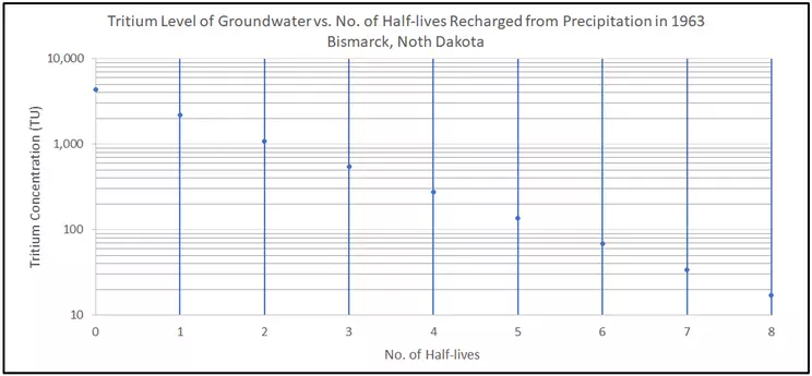
Step 2. CREATE an x-y scatter plot of the data.
Provenance: Yongli Gao, University of Texas at San Antonio
Reuse: This item is offered under a Creative Commons Attribution-NonCommercial-ShareAlike license http://creativecommons.org/licenses/by-nc-sa/3.0/ You may reuse this item for non-commercial purposes as long as you provide attribution and offer any derivative works under a similar license.
Under the Insert tab in Excel, you'll see the x-y scatter plot option. This is the most common plotting tool for the Earth Sciences when analyzing data. Plot the number of half-lives on the x-axis and the tritium concentration on the y-axis. Example problem 1 shows the Excel screenshots for each step to properly set up your graph. Be sure to properly label your axes! The default in Excel is a standard, linear axial scale. In order to change one or both of the axes to logarithmic, right-click on the axis in question and choose "Axis options." In the Axis tool that appears in the window to the right, there is a radio button to change to logarithmic (default base 10).
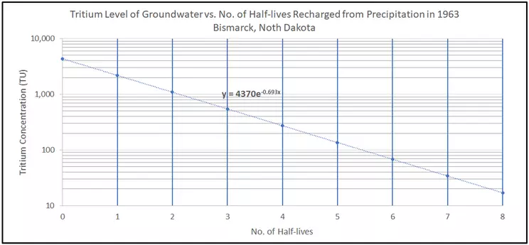
Step 3. Add a TRENDLINE to the graph.
Clearly, there is a relationship between tritium concentration and the number of half-lives.
Right-click on the data points in the Excel graph. A window will appear where you can choose to "Add Trendline." On the right side of the window, the trendline tool will open where you can choose what type of function best represents the data. There are several options, with radio buttons that allow you to try them out. In this case, a visual assessment of which of these functions "fits best" shows that "Exponential" is the right one. Note how all the data points are more or less on the trendline. Below the functions in the same window, click the radio button to add the Equation. The equation will appear on the graph near the trendline.
Remember that half-life is the time it takes for the decay of half of the number of radioactive atoms (in this case, the 3H, a.k.a. tritium atoms). The relationship of the tritium concentration and the number of half-lives can be described by an exponential equation like $C_n = C_0 * e^(ax)$, where Cn is the concentration of concentration after "n" half-lives and C0. Now, estimate the value of "a" to fit the data on the graph.
Provenance: Yongli Gao, University of Texas at San Antonio
Reuse: This item is offered under a Creative Commons Attribution-NonCommercial-ShareAlike license http://creativecommons.org/licenses/by-nc-sa/3.0/ You may reuse this item for non-commercial purposes as long as you provide attribution and offer any derivative works under a similar license.
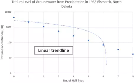
semi-log plot with linear trendline
Provenance: Rory McFadden, Carleton College
Reuse: This item is offered under a Creative Commons Attribution-NonCommercial-ShareAlike license http://creativecommons.org/licenses/by-nc-sa/3.0/ You may reuse this item for non-commercial purposes as long as you provide attribution and offer any derivative works under a similar license.
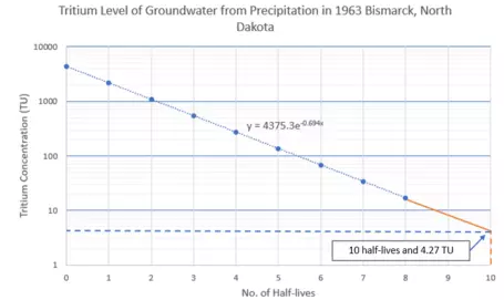
Step 4. ANALYZE the graph to determine the relationship between variables.
To determine the tritium concentration after 10 half-lives, we can now use the equation from Excel that corresponds to our line of best fit.
The equation was given as $y = 4370 * e^{-0.693x}$
So the tritium concentration after 10 half-lives C10 (y), based on the number of half-lives (x) would be `C_10 = 4370 * e^(-0.693*10)`
C10 = 4.27 TU
Does that match up with the trendline on the graph?
Semi-log plot with 4.27 TU answer labeled
Provenance: Rory McFadden, Carleton College
Reuse: This item is offered under a Creative Commons Attribution-NonCommercial-ShareAlike license http://creativecommons.org/licenses/by-nc-sa/3.0/ You may reuse this item for non-commercial purposes as long as you provide attribution and offer any derivative works under a similar license.
Where do you use Semi-log or Log-log plots in Earth science?
- Rating curves for stream flow and monitoring
- Pressure/Temperature gradients for Earth with depth
- Earthquake magnitudes
- Well-testing in Hydrogeology (Theis, Cooper-Jacob, etc.)
Next steps
I am ready to PRACTICE!
If you think you have a handle on the steps above, click on this bar to try practice problems with worked answers.
Or, if you want even more practice, see 'More help' below.More help (resources for students)
Pages written by Yongli Gao (The University of Texas at San Antonio) and Kyle Fredrick (Pennsylvania Western University - California, PA).