For the Instructor
These student materials complement the Coastal Processes, Hazards and Society Instructor Materials. If you would like your students to have access to the student materials, we suggest you either point them at the Student Version which omits the framing pages with information designed for faculty (and this box). Or you can download these pages in several formats that you can include in your course website or local Learning Managment System. Learn more about using, modifying, and sharing InTeGrate teaching materials.Preparing the Data for Plotting
- Click on the tab PROFILE PLOT SHEET.
- At the top of the page, click on the tab INSERT and select "Scatter Plot with Straight Lines" option from the dropdown list.
- A blank plot should appear on your worksheet.
- Now, click on the chart and then right click your mouse. A window will pop up that has a line "Select Data." Click this, and a new box will appear that allows you to specify which data you want to plot.
- On the left hand side of the "Select Data Source" box, click on the "add" button and a new box entitled "Edit Series" will appear. Place your cursor in the line for "Series name." Now, click on the PROFILE DATA Tab and find the cell with the first survey date (cell A4). Click on this cell, and the "Series name" line will be populated.
- Next, click in the area for "Series X values." Then, click on the PROFILE DATA tab and move your cursor to cell D4, which is the first value of the cumulative horizontal distances. Hold your mouse button down and drag all the way to the end of the cumulative horizontal distance column for that survey date.
- Now, click in the "Series Y values". Delete anything that is in that box and replace it with an equals sign. Now, click on the PROFILE DATA tab, click in cell E4 of the cumulative change in elevation column and, again, while holding your mouse button down, drag to the end of the column for that survey date.
- Now, hit "ok" and the Select Data Source box should still be open. Click "Add" to add the next survey date, and repeat the above process for the September 09, 1008 dataset. Repeat this procedure to include the third survey data. The final plot should look similar to the one shown in Figure 3.50.
- You will have to add axes titles, as well as a title at the top of the chart. This can be achieved by clicking on the "Chart Tools Layout" tab where additional buttons will appear for "Chart Title" and "Axis Titles".
- If you right click on the chart, a dropdown list will appear. Choose "Format Chart Area" to set the size of the chart to be 5" height and 9" width. All of your charts should be the same size, and the axis lengths should all be the same as well. Axis lengths can be adjusted by right clicking on each individual axis to highlight it, and then choose "format axis" option where you can set the range of values for that axis. The horizontal axis should span 0 to 100 and the vertical axis should range from 180 to -200. You also need to make sure that the X axis of the plot (horizontal distance) crosses the Y axis (relative elevation) at the -200 value of the Y axis. To do this, go to format the Y axis and you will see an axis value setting where you can change it from "fixed" to "axis crosses at", type in -200.
- Follow these steps for all three transects, and then answer the questions at the end of this assignment.
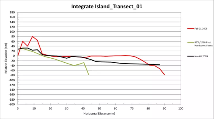
Figure 3.50: Plot of the first transect for three different survey dates, properly adjusted for colors, labels, main and axes titles, as well as horizontal and vertical scales.
