

Accessibility Guidelines for SERC Authors and Contributors
SERC supports broadening access to STEM education. To this end, we aim to make our web content accessible to all educators and learners, and to promote the creation and sharing of accessible teaching materials and resources.
Because we rely on educators and collaborators to build and improve the collections we host on our website, we ask you to consider your own practices in accessibility as you build curricula, develop teaching activities, or create web materials for other educators. Learn more about why accessibility is important and how it applies to good pedagogical approaches.
We strongly encourage authors and contributors to meet the basic requirements for web accessibility. This checklist and how-to will provide a basic set of accessibility improvements you can build into your workflow as you create teaching activities, build webpages on our site, or upload presentations and documents. These guidelines are easiest to adhere to if you keep them in mind as you create resources, rather than as a remedial effort later on.
Accessibility Checklist
Jump to the How-to content below by following the links in the checklist or simply scrolling down for more documentation.
When creating content on web pages as well as uploading files (e.g. Word Document, a PowerPoint, and PDFs):
- Make sure you are using headings to appropriately structure your content, and check that you have not skipped descending heading levels.
- Include alt text for any image you include.
- Ensure that all your text and visuals have high enough contrast to be perceived at different scales.
- Choose accessible fonts.
- Use the Check Accessibility tool in Word, Powerpoint, or Adobe Acrobat.
If you are working on a web page for a SERC project, consider the following in addition to the relevant items above:
- Write clear link text (no "click here" etc.) and notify the user if they open a new window.
- If you are uploading video content, include video captioning.
- If you are sharing teaching resources, consider how editable and repurposable they are.
- Test pages in Serckit with the WAVE web accessibility checker tool.
Accessibility How-to
Page Structure and Headings
Using headings in the proper order (i.e. Header > Sub-header > Sub-sub-header, etc.) is important for accessibility in documents and web pages. Headings organize content and make it navigable for those using screen readers, keyboard navigation rather than a mouse, and slow internet connections, etc. Combined with visual styles, headings are a powerful tool for organizing information and displaying it visually.
When creating documents in tools like Word, use the formal heading options built into the software rather than trying to imply headings through visual changes like font size or bolded text.
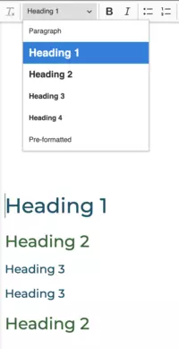
Instructions for heading use:
- Always start with h1 (heading 1)
- Always use headings in order (h1 to h6) when descending in hierarchy
- Items of equal rank should have the same heading level.
Guidance for using headings in Microsoft Word
Using Headings and Reading Order in Adobe Acrobat: Accessibility for Online Course Content
Descriptive link text and link behavior
When adding links to web pages or documents, it's important not only to consider the appearance of the link (see color and contrast), but also the clarity of the link text. Serckit allows you to make links, but it doesn't control what text you choose for the links. When writing link text, consider the following:
- How will the link text sound to someone using a screen reader with voiceover? Be clear and concise about where the link will take the user.
- Does the link text make sense out of context? Often while navigating using a screen reader, users will read from link to link without the surrounding text.
- Avoid non-specific, non-descriptive or redundant link text such as "click here" or "link" or "here."
Example link text
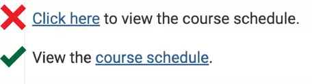
Write link text that describes accurately and clearly where the link will take the user.
Consider also that link behavior affects users as well. When inserting a link on a web page, causing the link to open in a new window should be avoided unless absolutely necessary, as this can cause some users difficulty with navigation. It also breaks navigation for smart phone or tablet users. If it is absolutely necessary to create a link that opens in a new window, include in the link text, in parentheses, "opens in a new window," e.g. "Course Schedule (opens in a new window)."
Colors and contrast
For normal text in web pages and documents alike, the guideline used to determine sufficient contrast for those with low vision, color blindness, or other disabilities is a minimum contrast ratio of 4.5:1 between the text (or graphic) color and the background, calculated using the hex codes describing the colors in html.
While text colors in Serckit may be limited by the setup of individual sites, it is important to be able to check existing text or other content for sufficient contrast, as well as graphics that you may include in a document or upload to a website.
For web pages in Serckit
Use the WAVE web accessibility checker plugin for Firefox or Chrome to check for text that has insufficient contrast.
To check whether colors in use on a web page are of sufficient contrast, or to test out color combinations for contrast, use the WebAIM color contrast checking tool . In order to input the colors you would like to test, use a color picker plugin like Colorzilla to extract hex codes of the colors of the text or background on the page (choose "Pick color from page;" clicking will automatically copy the hex code of your selection to the clipboard); or in Chrome, select and right click on the text, choose "Inspect" to open Developer Tools, and under "Styles," you will find hex codes for the selection.
WebAIM article on colors and contrast
WebAIM color contrast checking tool - web tool for checking contrast using hex codes of foreground and background colors
Colorzilla - plugin for Chrome/Firefox for extracting hex codes of colors on webpages
If your vision is unimpaired, use this tool to see what your file looks like to a person with color blindness: Coblis: Color Blindness Simulator
Font - type and size
Font type and size can affect the readability for sighted users. If you are working in Serckit, your font choices are made for you depending on the project site you are contributing to and the heading levels. However in creating documents, slideshows, and graphics including text, it is important to consider font choice. Some considerations from WebAIM's Typefaces and Fonts guidance:
- Use simple, familiar, and easily-parsed fonts.
- Avoid character complexity.
- Avoid character ambiguity (make sure there aren't characters that look too similar to another character).
- Use a limited number of typefaces, fonts, and font variations.
- Consider spacing and weight (e.g., line spacing, spacing between individual characters, the impact of italicizing on spacing).
- Avoid small font sizes.
Example accessible fonts:
Arial, Calibri, Helvetica, Verdana, Tahoma, and Times New Roman.
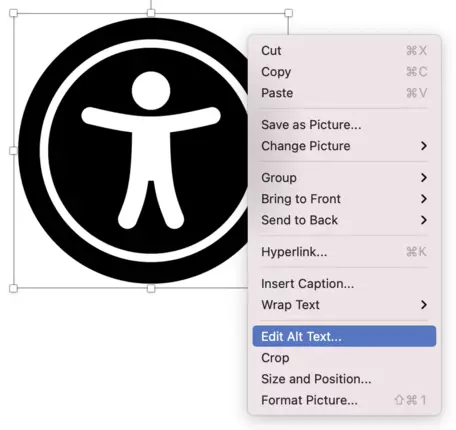
Images / alt-text. and descriptions
Alt text, or alternative text, is a critical element for accessibility of any non-text component. While it isn't visible in a document or on a page if you are not using assistive technology and the image loads fully, alt text is an attribute within an image's metadata that takes the place of an image when using a screen reader or other assistive technology and is visible to sighted users when images don't load (such as with a slow internet connection). As it functionally replaces the content of an image or supplements it when it less perceivable, good alt text gives a brief, relevant description of the image and its meaning in the context. Alt text can also make an image more searchable. You can read about what makes alt text effective on WebAIM's Alternative Text documentation.
In Documents/Presentations
In Serckit
W3C's Tips for Writing Meaningful Text Alternatives for Images
Video captioning
When including video content in web pages or as part of a presentation, it is important to always add captions. Captions can make it possible for those who are hard-of-hearing or deaf to access the information, and they can improve the ability for people with cognitive disabilities or situational limitations to perceive and understand the content.
If you are uploading video content to a site, consider how to include captions at different stages of your work.
- Use built-in closed captioning when recording, if possible. If you are recording in a software that can automatically generate a transcript or captions, (such as recording a lecture or meeting over Zoom, or streaming/uploading a video to Youtube), make sure to enable closed captions before you begin streaming or recording.
- Generate captions for a video using a free or paid service such as one listed by UW's article Captioning Your Own Video for Free or Rev.com
- Tie captions to video files in Serckit if needed. An Implementation Team member of the SERC Staff can help you upload .vtt caption files and tie them to the appropriate video.
W3C's Tips for creating transcripts and captions for multimedia
W3C Perspectives on Video Captions and Accessibility - video
University of Washington: Creating Accessible Videos
University of Washington: Captioning Your Own Video for Free
Document and Presentation Accessibility
When you are creating a document in Microsoft Word, a PowerPoint presentation, or a PDF, a good way to catch many accessibility issues is to use the built-in accessibility checker in the software. While these tools are somewhat limited, they may highlight some easy-to-fix accessibility issues.
- In Microsoft Word: Go to Tools > Check Accessibility or Review > Check Accessibility to open a panel with warnings and errors.
- In Microsoft PowerPoint: Go to Tools > Check Accessibility to open a panel with warnings and errors.
- In Adobe Acrobat: Go to Tools > Accessibility. If you do not see Accessibility listed in tools, click More Tools or Search for Accessibility in the Tools page. There are many options for setting reading order, headings, and alt text. You can use the Accessibility Check button to review your pdf for accessibility.
Editable and Repurposable Content
When you are sharing materials with other educators consider including the editable or 'raw' versions of the content if your polished version is an non-repurposable format. This will allow other educators, and their students. to modify it to fit their local context and needs. For example, we encourage you to:
- Provide text documents in editable formats (Word, plain text) rather than (or in addition to) static formats like PDF. With a Word document, a dyslexic learner can easily change the font to the Dyslexie font for easy reading, and an instructor can modify an assignment to match their curricular needs.
- Provide the raw data along with graphs and other visualizations. Access to the raw data (as a csv file or spreadsheet) will allow a visually impaired learner to dig deeper into a graph than whatever textual alternative you've provided, and allow the data to be combined with other data and be presented in other ways.
- Provide access to the underlying markup for any equations. Access to the raw markup (LaTeX, or MathML) for any equations you present gives the learner many more access options. Especially if your current approach just presents equations as pictures.
Learning more about Accessibility
To learn more about how to make educational materials you're sharing with others more accessible, we recommend starting with the STEM OER Accessibility Framework. This guide is specifically focused on issues relevant to educators in STEM sharing teaching resources with each other. It builds on some of the ideas above and points to a wide array of additional resources that go into more depth.