- You should wear your raincoat today; I think it is going to rain.
- My grandfather told me that 40 years ago we used to get a lot more snow in December, now we don't see snow until mid-January.
- It seems like we had a very short summer here in Idaho this year.
- Springtime is the rainy season here in Arizona.
- We had hail the size of golf balls in last week's storm.
- I've noticed that many new types of plants grow here in North Dakota; the winters just aren't as cold as they used to be 30 years ago.
- Every summer we have a picnic by the beach in July; it is always warm and breezy.
- This afternoon was hot; I think we set a new record.
- We should go sailing this afternoon; it is breezy this morning, and the wind is supposed to come up later today.
Track a storm system
Get a feel for the rate at which typical weather systems travel over a week's time by viewing a slide show of one week's weather. Examples of these systems are shown on the weather map, upper-right, as blue high (H) and red low (L) pressure regions, and their related frontal zones. Play the entire slideshow, below, see all the slides. Then play it again one slide at a time and examine it more closely. Choose one H (high) or L (low), or a front (blue or red lines), and follow the high or low with your pencil tip as it moves across the map, through space and time. Note: the slide show can be played full screen mode.
Image Source: Wikipedia.

![[creative commons]](/images/creativecommons_16.png)
Provenance: wikipedia
Reuse: This item is offered under a Creative Commons Attribution-NonCommercial-ShareAlike license http://creativecommons.org/licenses/by-nc-sa/3.0/ You may reuse this item for non-commercial purposes as long as you provide attribution and offer any derivative works under a similar license.
For more information about what the symbols mean (beyond the scope of this lesson), read this page:
Weather Map Symbols.
 Click to view
In this exercise, you will get a sense of how fast storm systems move across the contiguous (lower 48) United States, by recording and drawing the storm tracks of the two weather systems shown in the slide show above.
- Print out a blank outline map of the United States. (shown right)
Click the image to enlarge the map to full size and then download, save, and print the map.
- Using the printed maps from the link below or the online maps in the animation above, locate the first map in the series. Note and record the date and time of this map.
- Observe the location of the first low pressure center in the Seattle, Washington area on March 30, 2012.
- Record its location on the blank U.S. map by drawing a L on the blank map and circling it.
- Advance to the next map image, March 31, 2012. Note the location of the low, now located near northern Idaho. Record this new on your blank map.
- Advance to the 3rd map image. The low pressure is now over Montana. Again, record the location on your blank map.
- Repeat this procedure for the next several map images, following one storm as it travels across the country, and eventually heads out across the Atlantic Ocean.
- Draw a black line connecting the location of the low across the map.
- Rewind the map images to April 2nd, 2012, and track a second storm. Either start with the one off the coast of Washington, or the one located over South Dakota.
- When you are done tracking the storm, answer the Stop and Think questions listed below.
Click here to download a
storm tracking (Acrobat (PDF) 1.9MB Feb2 22) PDF file of the instructions and image files.
Stop and Think
1. Which day (date) did the L pressure move off the Atlantic coast?
2. How many days did it take for the storm to travel across the country?
3. Given the distance the storm traveled as approximately 2700 miles (4350 kilometers), what was the average rate of travel of the storm? Express your answer in miles (or kilometers) per day.
Discuss
Talking about the Weather
Some areas have weather patterns that are more variable than others. You may have heard the adage: "If you don't like the weather in Vermont (or some other place...), just wait five minutes." How fast does the weather change in your hometown or neighborhood?
Recall the regional climate drivers that you studied in Labs 3A and 3B. Which of these factors contributed to the movement of this storm system across the country? Choose a location on the storm track and use your knowledge to write out a script that could be used by a TV meteorologist to describe the weather patterns shown in the series of images. Share your weather story with your lab team or class.
Use weather data to discover climate patterns

Measuring instruments used for current observations and data reporting
![[reuse info]](/images/information_16.png)
Provenance: NOAA http://www.ncdc.noaa.gov/land-based-station-data
Reuse: This item is in the public domain and maybe reused freely without restriction.
In this next activity, you will use the NOAA's National Climatic Data Center (NCDC) records to explore temperature and precipitation data for a selected area. You will begin by selecting one single year's worth of data to view, and then you will expand the graph to display data from an extended period of time
—up to 120 years. By exploring this historical dataset, you will learn how daily weather patterns vary over a typical year and you will get a sense of how climatologists use long-term records to arrive at a definition of "normal" temperature and precipitation.
When you have investigated these concepts, you will apply your skills by using the NCDC site to inform your answer to the question: "What will I wear to my cousin's wedding in May?"
When we think of weather we often only think of today, this week or this month. However, if you step back and look at a large collection of weather data it is possible to use the daily records to visualize the climate. The NCDC archives many variables of weather and climate data, summarizing the data in both monthly and daily time frames, making many types of research possible.
The daily data recorded at these NCDC stations includes observations of: maximum and minimum temperature, precipitation amount, snowfall amount, and snow depth. Monthly data includes mean, maximum, and minimum temperature and total precipitation.
The data you will use in this activity is available at the following website. Access the National Climatic Data Center's Divisional Data Interface ( This site may be offline. ) (link will open in a new window) to begin your investigation.
- On the Data Retrieval page, click the "State" tab first and choose Montana, then click the "Division" tab.
- Select the Eastern division or region of the state. Your teacher may assign another place for you to investigate.
- Use the dropdown menus to select Starting and Ending dates that span the last full calendar year (January through December).
- Click the Static Graphs radio button and select Temperature from the pull-down menu.
- Next to the word "Show," make sure that "All Months" is showing.
- Click Submit.
- On the graph that appears, read the axes labels and the legend to interpret what it means. Does this graph provide you with enough information to know what to wear to the wedding?
Temperatures on the graph represent mean (average) temperatures in degrees Fahrenheit. The average temperatures reflect day and night temperatures across eastern Montana.
- Use your browser's back button to go back to the Data Retrieval Page. Use the same selections as before, except for changing the Start Date two years earlier so that you request the last 3 years of temperature data.
- On the three-year temperature graph, check and record the values reported for each May.
- Go back to the Data Retrieval Page again. This time, request a static graph of precipitation for the last full year (January to December). Read the axes to interpret the graph. Look for patterns that indicate whether the region you are studying appears to have a rainy season or a dry season.
- Generate another graph to show three years of precipitation data.
Checking In
What new patterns emerge in the plotted data when you add more years to the graph?
The pattern is still highly variable, but, in general, you can see that in this part of the United States, it is warmest in July and August and coldest in November, December, January and February. With this amount of data you can see that there is a lot more variation of temperatures in the winter months.
However, you can begin to see that there are patterns that emerge year after year, giving you a sense of "normal" weather which is known as climate.
- Go back to the Data Retrieval Page again. In the drop-down box next to the word Show, highlight "May" and set the Starting and Ending Dates to request May temperatures for the last 10 years.
Do a Reality Check... Look to see if the values seem realistic. If they don't, try setting the month of the Starting Date to the same date as you are requesting. For example, to request May temperatures, set the month of the Start Date to 05.
- Explore the data by generating several more graphs, requesting temperatures and precipitation levels for various months over the full range of the data.
- For more weather variables, such as wind speed and barometric pressure, access the Weather Underground historical data website. Again, input your city, and date range of choice in order to observe daily, weekly, monthly, or custom date range data outputs.
Stop and Think
4. How do the long-term graphs of weather data compare to the original (single year) graph? Which type of graph is a better representation of typical temperature and precipitation for a station?
5. Your cousin in Hastings, Nebraska (NE) has invited you to her outdoor wedding in early May. What will you wear? What is the likelihood that you will you need a sweater or jacket? Might it be over 100° in which case you better bring shorts! Is it likely that it will it rain? Use the NCDC and Weather Underground sites to investigate historical Nebraska temperature and precipitation data in order to answer this question. Explain your clothing selection and your procedure for arriving at this decision.
Optional Extensions

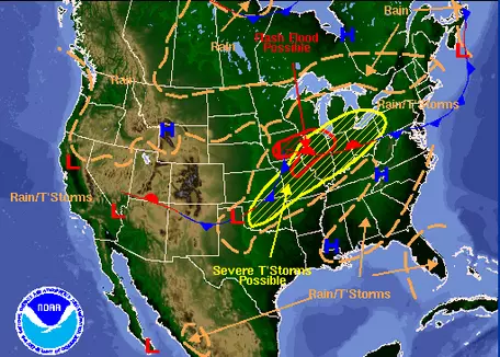 Weather map for June 10, 2011. Weather maps are available daily from the National Weather Service ( This site may be offline. ) .
