Using Graphs in Economics
Introduction
![[creative commons]](/images/creativecommons_16.png)
Provenance: Jeffrey Sarbaum, University of North Carolina at Greensboro
Reuse: This item is offered under a Creative Commons Attribution-NonCommercial-ShareAlike license http://creativecommons.org/licenses/by-nc-sa/3.0/ You may reuse this item for non-commercial purposes as long as you provide attribution and offer any derivative works under a similar license.
Economic relationships can be described in:
- Words. Higher prices cause producer to increase the quantity supplied of a good or service
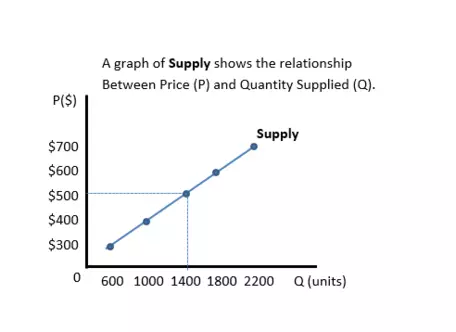
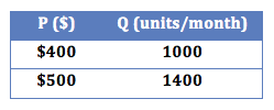
- Numbers, as in the table shown at the right.
But even more effective is a graph, As they say, a picture is worth a thousand words! A graph is a visual way to show relationships between concepts or data.

![[creative commons]](/images/creativecommons_16.png)
Provenance: Jeffrey Sarbaum, University of North Carolina at Greensboro
Reuse: This item is offered under a Creative Commons Attribution-NonCommercial-ShareAlike license http://creativecommons.org/licenses/by-nc-sa/3.0/ You may reuse this item for non-commercial purposes as long as you provide attribution and offer any derivative works under a similar license.
Graphing data is an important part of the study of economics. Think of graphs as useful shortcuts to understanding the information you are working with.
- Visualizing data on graphs can help us interpret relationships between economic variables.
- Graphing data helps us see trends.
Interpreting graphs in economics

![[creative commons]](/images/creativecommons_16.png)
Provenance: Peter Schuhmann, University of North Carolina Wilmington
Reuse: This item is offered under a Creative Commons Attribution-NonCommercial-ShareAlike license http://creativecommons.org/licenses/by-nc-sa/3.0/ You may reuse this item for non-commercial purposes as long as you provide attribution and offer any derivative works under a similar license.
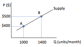
- Most graphs show a relationship on two axes.
- The left-to-right (horizontal) line is the X-axis, in this case, quantity Q.
- The up-and-down (vertical) line is the Y-axis, in this case, price P.
- The point where the two axes intersect is called the origin --- where the values of each variable is zero.
- Any point on a graph shows the relationship between X and Y. In this example, when Q is 1400, P is $500.
- A series of points on a graph shows how the two variables are related. In this case, the quantity supplied rises as price increases.
If a line slopes upwards from left to right, then the relationship between the two variables is positive, or direct, meaning that high values of one variable go with high values of the other variable. If a line slopes downward from left to right, then the relationship is negative, or inverse, meaning that high values of one variable go with low values of the other variable.
The positive supply slope shows that sellers will bring more units of a good to market at higher prices.
(
Learn more about slope)
-
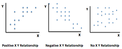
Sometimes X-Y data points on a graph do not all fall on an exact line. By graphing the data points for X and Y we can better understand the relationship between these two variables.

![[creative commons]](/images/creativecommons_16.png)
Provenance: Jeffrey Sarbaum, University of North Carolina at Greensboro
Reuse: This item is offered under a Creative Commons Attribution-NonCommercial-ShareAlike license http://creativecommons.org/licenses/by-nc-sa/3.0/ You may reuse this item for non-commercial purposes as long as you provide attribution and offer any derivative works under a similar license.
-
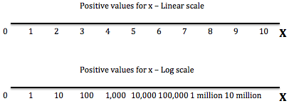
Sometimes different numerical scales are used on an axis. For example, the image below shows:

![[creative commons]](/images/creativecommons_16.png)
Provenance: Jeffrey Sarbaum, University of North Carolina at Greensboro
Reuse: This item is offered under a Creative Commons Attribution-NonCommercial-ShareAlike license http://creativecommons.org/licenses/by-nc-sa/3.0/ You may reuse this item for non-commercial purposes as long as you provide attribution and offer any derivative works under a similar license.
- at the top, a linear scale, where the values go up one unit at a time
- at the bottom, a log scale, where the values go up by 10x units at time, where x=0,1,2,3,4, etc. --- that is 1, 10, 100, 1,000, 10,000, etc.
-
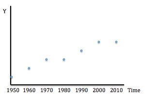
When time is on an axis, we call the diagram a time series graph. For example, the image below is a time series graph showing how the variable Y changes from 1950 to 2010.

![[creative commons]](/images/creativecommons_16.png)
Provenance: Jeffrey Sarbaum, University of North Carolina at Greensboro
Reuse: This item is offered under a Creative Commons Attribution-NonCommercial-ShareAlike license http://creativecommons.org/licenses/by-nc-sa/3.0/ You may reuse this item for non-commercial purposes as long as you provide attribution and offer any derivative works under a similar license.
Interpreting linear relationships on a graph

![[creative commons]](/images/creativecommons_16.png)
Provenance: Jeffrey Sarbaum, University of North Carolina at Greensboro
Reuse: This item is offered under a Creative Commons Attribution-NonCommercial-ShareAlike license http://creativecommons.org/licenses/by-nc-sa/3.0/ You may reuse this item for non-commercial purposes as long as you provide attribution and offer any derivative works under a similar license.
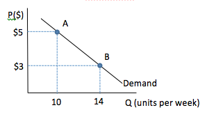
Graphs of linear relationships are straight lines. To interpret a linear relationship on a graph, complete the following steps:
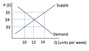
- Choose a value of the variable on the X axis and draw a line upward until you reach the line plotted on the graph. In this example, we have drawn a line up from 10 on the X, or Q, axis.
- Draw another line across to find the corresponding value of the variable on the Y axis. In this case, 5 on the Y, or P, axis.
- Repeat steps (1) and (2) for a higher value of the X variable.
- If the value of Y is lower then the graph shows a negative, or inverse, relationship. In our example, when Q is 14 on the X axis, P is 3 on the Y axis. This means that as one variable, Q, increases, the other variable, P, decreases.
- If the value of Y is higher than before, then the graph shows a positive, or direct, relationship. This means that as one variable increases, the other variable increases.
Interpreting nonlinear relationships on a graph

![[creative commons]](/images/creativecommons_16.png)
Provenance: Peter Schuhmann, University of North Carolina Wilmington
Reuse: This item is offered under a Creative Commons Attribution-NonCommercial-ShareAlike license http://creativecommons.org/licenses/by-nc-sa/3.0/ You may reuse this item for non-commercial purposes as long as you provide attribution and offer any derivative works under a similar license.
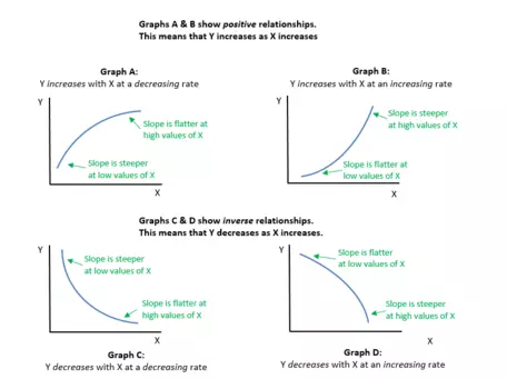
Graphs of non-linear relationships are curved lines. Let's look at how we interpret a nonlinear graph:
- Choose a value of the variable on the X axis and draw a line upward until you reach the line plotted on the graph.
- Draw another line across to find the corresponding value of the variable on the Y axis.
- Repeat steps (1) and (2) for a higher value of the X variable.
- If the value of Y is also higher then the graph shows a positive, or direct, relationship. This means that as one variable increases, the other variable also increases.
- If the value of Y is lower than before, then the graph shows a negative, or inverse, relationship. This means that as one variable increases, the other variable decreases.
So far, this should be familiar from the linear graphs we looked at above.
- Now we look at how the slope of the line changes as the value of X increases.
- For positive (direct) relationships, if the line gets flatter at higher values of X, then the value of Y increases with the value of X, at a decreasing rate. (That is, Y goes up with X, but it goes up by smaller and smaller amounts.) This is shown in Graph A.
- If the line gets steeper at higher values of X, then the value of Y increases with the value of X at an increasing rate (That is, Y goes up with X, but it goes up by larger and larger amounts.) This is shown in Graph B.
- For negative (inverse) relationships, if the line gets flatter at higher values of X, then the value of Y decreases with the value of X at a decreasing rate (That is, Y goes down as X goes up, but Y goes down by smaller and smaller amounts.) This is shown in Graph C.
- If the line gets steeper at higher values of X, then the value of Y decreases with the value of X at an increasing rate. (That is, Y goes down as X goes up, but Y goes down by larger and larger amounts.) This is shown in Graph D.
➜ Shifts vs. Movements on a graph

![[creative commons]](/images/creativecommons_16.png)
Provenance: Jeffrey Sarbaum, University of North Carolina at Greensboro
Reuse: This item is offered under a Creative Commons Attribution-NonCommercial-ShareAlike license http://creativecommons.org/licenses/by-nc-sa/3.0/ You may reuse this item for non-commercial purposes as long as you provide attribution and offer any derivative works under a similar license.
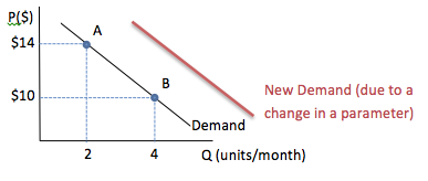
It is very important to remember the following two things when interpreting graphical relationships:
- The demand curve in the example graph shows a relationship between only two variables, P and Q. When one of these variables changes we find a new point on the demand curve shown. In this case, when the variable P goes from 10 to 14 the variable Q goes from 4 to 2, and we move along the graph from point B to point A.
- This demand curve is based on a fixed set of parameters (possibly buyer income, buyer tastes and preferences, etc.) If any of these parameters change, it will cause a shift in the demand curve, and a new set of data points for P and Q. In the image, a shift is shown by the new, red, demand curve.
Where are graphs used in Macroeconomics?
In macroeconomics, graphs are often used to represent relationships between broadly defined economic variables such as the overall price level, total output in an economy or unemployment.
-

PPF
![[creative commons]](/images/creativecommons_16.png)
Provenance: Wikipedia
Reuse: This item is offered under a Creative Commons Attribution-NonCommercial-ShareAlike license http://creativecommons.org/licenses/by-nc-sa/3.0/ You may reuse this item for non-commercial purposes as long as you provide attribution and offer any derivative works under a similar license.
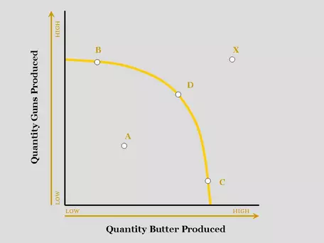
A Production Possibilities Curve shows how much of two goods can be produced.
- The curve in our example is downward-sloping. There is an inverse relationship. In this case, more guns means less butter.
- The graph is non-linear, showing that the trade-off --- or loss of butter for more guns --- becomes greater as more guns are produced.
-

![[creative commons]](/images/creativecommons_16.png)
Provenance: Peter Schuhmann, University of North Carolina Wilmington
Reuse: This item is offered under a Creative Commons Attribution-NonCommercial-ShareAlike license http://creativecommons.org/licenses/by-nc-sa/3.0/ You may reuse this item for non-commercial purposes as long as you provide attribution and offer any derivative works under a similar license.
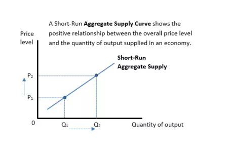
The Short-Run Aggregate Supply Curve shows the relationship between the overall price level and the output in an economy (GDP) over a short period of time, say one or two years.
- The graph here is upward-sloping, showing an increase in the overall price level is associated with an increase in the quantity produced.
- The graph is linear, showing a simple model in which output increases at the same rate for any change in the price level.
-

![[creative commons]](/images/creativecommons_16.png)
Provenance: Peter Schuhmann, University of North Carolina Wilmington
Reuse: This item is offered under a Creative Commons Attribution-NonCommercial-ShareAlike license http://creativecommons.org/licenses/by-nc-sa/3.0/ You may reuse this item for non-commercial purposes as long as you provide attribution and offer any derivative works under a similar license.
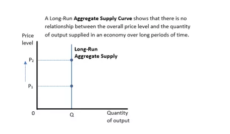
The Long-Run Aggregate Supply Curve shows the relationship between the overall price level and the output in an economy (GDP) over a long period of time. This graph is a vertical line, showing that changes in the overall price level have no effect on the quantity produced.
-

![[creative commons]](/images/creativecommons_16.png)
Provenance: Jeffrey Sarbaum, University of North Carolina at Greensboro
Reuse: This item is offered under a Creative Commons Attribution-NonCommercial-ShareAlike license http://creativecommons.org/licenses/by-nc-sa/3.0/ You may reuse this item for non-commercial purposes as long as you provide attribution and offer any derivative works under a similar license.
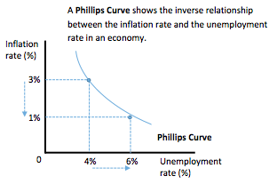
The Phillips Curve shows the inverse relationship between inflation and unemployment in the short run.
- It is downward sloping, showing that an increase in unemployment may be associated with a decline in the inflation rate.
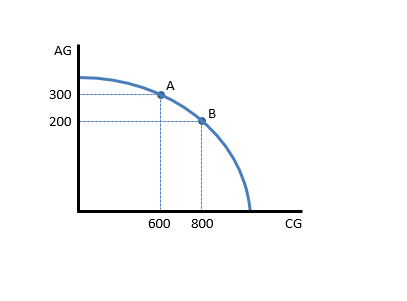
An economist wants to estimate how much Agricultural Goods (AG) must be given up to produce more Consumer Goods (CG). The production possibilities curve shows that the nation produced 300 units of agricultural goods and 600 units of consumer goods in 2014. What is the opportunity cost of increasing the production of consumer goods to 800 units in 2015? That is, what is the tradeoff for this nation in moving from point A to point B on the graph shown below

![[creative commons]](/images/creativecommons_16.png)
Provenance: Peter Schuhmann, University of North Carolina Wilmington
Reuse: This item is offered under a Creative Commons Attribution-NonCommercial-ShareAlike license http://creativecommons.org/licenses/by-nc-sa/3.0/ You may reuse this item for non-commercial purposes as long as you provide attribution and offer any derivative works under a similar license.
If the production of consumer goods increases to 800 units, the nation must lower the production of agricultural goods to 200 units. The opportunity cost of producing these additional 200 units of consumer goods is the 100 units of agricultural goods that must be given up. Note that this opportunity cost will change, depending on where we are on the graph.
Where are graphs used in Microeconomics?
In microeconomics, graphs are often used to represent relationships between economic variables, such as the price vs. quantity, or between the quantities of two different goods that can be purchased by a consumer.
- Supply and Demand graphs show the relationship between price and quantity for buyers (demand) and sellers (supply).

![[creative commons]](/images/creativecommons_16.png)
Provenance: Jeffrey Sarbaum, University of North Carolina at Greensboro
Reuse: This item is offered under a Creative Commons Attribution-NonCommercial-ShareAlike license http://creativecommons.org/licenses/by-nc-sa/3.0/ You may reuse this item for non-commercial purposes as long as you provide attribution and offer any derivative works under a similar license.
- The downward sloping demand curve shows the quantities buyers are willing to buy at various prices.
- The upward sloping supply curve shows the quantities sellers are willing to sell at various prices.
- Where the supply and demand lines intersect, the quantity buyers want to buy is the same as the quantity the sellers want to sell at the same price. This quantity and price is called the equilibrium. In this case, P=$4 and Q=12.
- At a price below the equilibrium the quantity the buyers demand is larger than the quantity sellers supply. This gap between the demand curve and the supply curve is called a shortage. In this case, at P=$3 the shortage is 10-12=-2
- At a price above the equilibrium the quantity sellers supply is higher than the quantity buyers demand. This gap between the supply curve and the demand curve is called a surplus. In this case, at P=$5 the surplus is 14-10=4
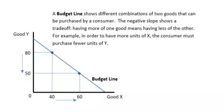
- A Budget Line shows different combinations of two goods that are affordable to a consumer given the consumer's income and the prices of the two goods.

![[creative commons]](/images/creativecommons_16.png)
Provenance: Peter Schuhmann, University of North Carolina Wilmington
Reuse: This item is offered under a Creative Commons Attribution-NonCommercial-ShareAlike license http://creativecommons.org/licenses/by-nc-sa/3.0/ You may reuse this item for non-commercial purposes as long as you provide attribution and offer any derivative works under a similar license.
- The downward sloping line illustrates a tradeoff: purchasing more of one good means you are able to purchase less of the other good.
- The graph is linear, showing that the trade-off between good Y and good X occurs at a constant rate.
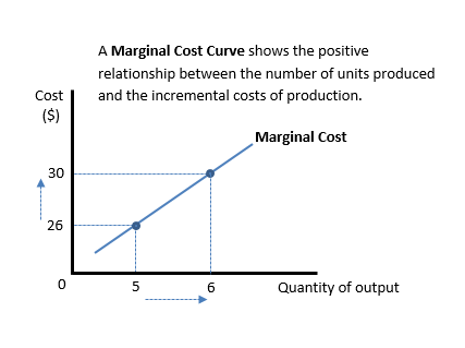
- A Marginal Cost Curve shows the relationship between the quantity of a good produced and the incremental costs of production.

![[creative commons]](/images/creativecommons_16.png)
Provenance: Peter Schuhmann, University of North Carolina Wilmington
Reuse: This item is offered under a Creative Commons Attribution-NonCommercial-ShareAlike license http://creativecommons.org/licenses/by-nc-sa/3.0/ You may reuse this item for non-commercial purposes as long as you provide attribution and offer any derivative works under a similar license.
- The upward-sloping line shows that as more units are produced, the incremental costs of production rise.
- The graph is linear, showing a model in which the increase in costs increases at a constant rate.
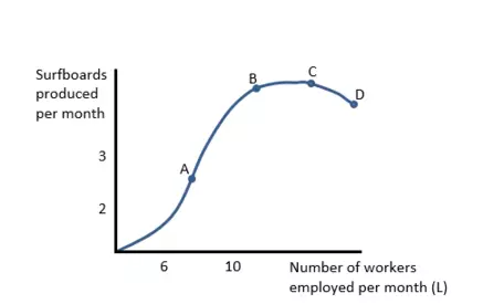
- A Total Product of Labor Curve shows the relationship between the quantity of output produced and the amount of labor used.

![[creative commons]](/images/creativecommons_16.png)
Provenance: Peter Schuhmann, University of North Carolina Wilmington
Reuse: This item is offered under a Creative Commons Attribution-NonCommercial-ShareAlike license http://creativecommons.org/licenses/by-nc-sa/3.0/ You may reuse this item for non-commercial purposes as long as you provide attribution and offer any derivative works under a similar license.
- The slope of this line changes (it is non-linear), indicating that the relationship between these two variables changes. At low values of labor (L), the line is upward sloping and getting steeper - more units of labor lead to increasing additional units of output. This initial shape is likely due to the increased gains in productivity as the workers specialize.
- At higher values of labor, the slope becomes flatter and eventually the slope is zero - in this range, more units of labor lead to fewer additional units of output. This "flattening" is likely due to the exhaustion of specialization opportunities and the onset of diminishing returns to labor productivity.
- Eventually, if "too much" labor is used, the slope can become negative.
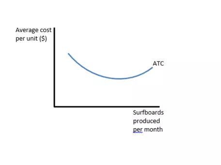
- An Average Cost Curve shows the relationship between the average cost of producing output and the quantity of output produced.

![[creative commons]](/images/creativecommons_16.png)
Provenance: Peter Schuhmann, University of North Carolina Wilmington
Reuse: This item is offered under a Creative Commons Attribution-NonCommercial-ShareAlike license http://creativecommons.org/licenses/by-nc-sa/3.0/ You may reuse this item for non-commercial purposes as long as you provide attribution and offer any derivative works under a similar license.
- This line resembles a "u-shape", i.e. it is non-linear.
- The average cost of production decreases with additional output at first, but eventually increases.
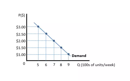
Suppose a restaurant's current price for tacos is $2.00 each. The owner wants to know what will happen to sales and revenue if price is raised to $2.50?
We can use a graph illustrating the demand for tacos to answer these questions.

![[creative commons]](/images/creativecommons_16.png)
Provenance: Peter Schuhmann, University of North Carolina Wilmington
Reuse: This item is offered under a Creative Commons Attribution-NonCommercial-ShareAlike license http://creativecommons.org/licenses/by-nc-sa/3.0/ You may reuse this item for non-commercial purposes as long as you provide attribution and offer any derivative works under a similar license.
The quantity of tacos demanded at a price of $2.00 is 700 units per week. The revenue is the price multiplied by the amount sold. In this case, $2.00 x 700 = $1,400. When the price is $2.50, the quantity of tacos demanded will fall to 600 units per week, and the revenue will rise to $2.50 x 600 = $1,500.
✓ Final thoughts on using graphs
- Observing a positive or negative relationship --- or correlation --- on a graph does not prove that a change in one variable causes a change in the other variable. Two variables can be correlated, or tending to move in similar/opposite directions, without causation. In other words, just because a relationship/correlation exists between the two variables, it does not guarantee that a change in one will cause a change in the other.
- When we use graphs to study the relationship between two economic variables, we typically invoke the ceteris paribus assumption, holding other factors constant in our graph that may not be constant in reality. When other factors do change, we may need to rethink (and redraw) the relationship shown on our graph.


![[creative commons]](/images/creativecommons_16.png)
