Graphing Data in Economics
Introduction
Graphing data is an important part of the study of economics. Think of graphs as useful shortcuts to understanding the information you are working with.
- Visualizing data on graphs can help us understand relationships between economic variables.
- Graphing data helps us see trends.
Suppose that we have the following information from ten people on years of education completed and current hourly wage rate:

![[creative commons]](/images/creativecommons_16.png)
Provenance: Jeffrey Sarbaum, University of North Carolina at Greensboro
Reuse: This item is offered under a Creative Commons Attribution-NonCommercial-ShareAlike license http://creativecommons.org/licenses/by-nc-sa/3.0/ You may reuse this item for non-commercial purposes as long as you provide attribution and offer any derivative works under a similar license.
Making sense of this table of data is difficult.
However, looking at a graph of this data quickly shows that wages tend to rise with education. We can also see, since the plotted points are not exactly aligned, that there isn't a perfect relationship between education and wages.

![[creative commons]](/images/creativecommons_16.png)
Provenance: Jeffrey Sarbaum, University of North Carolina at Greensboro
Reuse: This item is offered under a Creative Commons Attribution-NonCommercial-ShareAlike license http://creativecommons.org/licenses/by-nc-sa/3.0/ You may reuse this item for non-commercial purposes as long as you provide attribution and offer any derivative works under a similar license.
How do I graph data?
To plot data on a graph, complete the following steps:
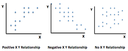
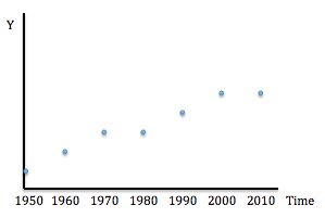
- Decide which type of graph your data requires. Most graphs in economics are of two types:
- Decide which variable will be measured on the X (horizontal) axis, and which variable will be measure on the Y (vertical) axis.
- For a time series plot, time always goes on the x axis.
- In a scatter plot, usually the independent variable --- the one doing the "causing" --- goes on the X axis. The one exception in economics is that price which always goes on the Y axis.
- Determine the scale for X and the scale for Y.
- In a scatter plot, the origin is usually zero for both X and Y.
-
In a time series plot, the origin will be the lowest year for X, and zero for Y.
Note: If there is a large difference between zero and the range of data points, it may make sense to begin with a higher number at the origin.
- Determine a range for X and Y that includes all the data points.
- Identify and mark scales within your range using units such as 1, 2, 3 or 10, 20, 30 or 100, 200, 300. Make sure they are accurately spaced apart.
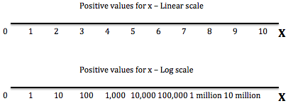
For measurements that vary tremendously in scale --- such as 1, 2, 100, 1,000, 1,000,000 --- logarithmic scales are appropriate. On a log scale, the marks are spaced based on exponential powers such as 101, 102, 103, etc.

![[creative commons]](/images/creativecommons_16.png)
Provenance: Jeffrey Sarbaum, University of North Carolina at Greensboro
Reuse: This item is offered under a Creative Commons Attribution-NonCommercial-ShareAlike license http://creativecommons.org/licenses/by-nc-sa/3.0/ You may reuse this item for non-commercial purposes as long as you provide attribution and offer any derivative works under a similar license.
- Mark each of the data points on the graph using the scales for X and Y as guides.
- Evaluate the relationship between X and Y in the graph, based the data points.
An example

![[creative commons]](/images/creativecommons_16.png)
Provenance: Peter Schuhmann, University of North Carolina Wilmington
Reuse: This item is offered under a Creative Commons Attribution-NonCommercial-ShareAlike license http://creativecommons.org/licenses/by-nc-sa/3.0/ You may reuse this item for non-commercial purposes as long as you provide attribution and offer any derivative works under a similar license.
A taco company is interested in understanding the relationship between the price of tacos and the quantity that consumers are willing to purchase. The data in the table show weekly sales (quantity demanded per week) at different prices.
- The graph will be a scatter plot.
- Label our horizontal axis "Q" (in hundreds of units), and create a scale that covers the range of quantity demanded data.
- Label the vertical axis "P", and create a scale that covers the range of price data.
- Plot the data points on the graph. For example, the first data point in the table is Q=5 when P=$3.00. This intersection is the Q=5, P=$3.00 data point for the graph.
- Locate the 5 on the Q axis and $3.00 on the P axis. Go up vertically from 5 and to the right horizontally from $3.00 until the two lines intersect.
- Continue this process for the remaining four data points in the table.
- After all the points have been plotted, we can connect them to illustrate the relationship. Notice that the line is downward-sloping, indicating inverse/negative relationship between the price of tacos and the quantity that consumers demand.

![[creative commons]](/images/creativecommons_16.png)
Provenance: Peter Schuhmann, University of North Carolina Wilmington
Reuse: This item is offered under a Creative Commons Attribution-NonCommercial-ShareAlike license http://creativecommons.org/licenses/by-nc-sa/3.0/ You may reuse this item for non-commercial purposes as long as you provide attribution and offer any derivative works under a similar license.
Examples of graphing data in Macroeconomics
In macroeconomics, we plot data on graphs to illustrate the relationships between broadly defined economic variables, such as the overall price level, total output in an economy, and unemployment. Sometimes economists are interested in how a variable changes over time. Other times there are interested in the relationship between two variables.
- Plotting data on GDP over time. The table shows total U.S. GDP in billions of dollars from 2000 through 2014.
- The graph will be a time series plot.

![[creative commons]](/images/creativecommons_16.png)
Provenance: Peter Schuhmann, University of North Carolina Wilmington
Reuse: This item is offered under a Creative Commons Attribution-NonCommercial-ShareAlike license http://creativecommons.org/licenses/by-nc-sa/3.0/ You may reuse this item for non-commercial purposes as long as you provide attribution and offer any derivative works under a similar license.
- Years 2000 through 2014 will go on the X axis.
- GDP will be on the Y axis.
- GDP on the Y axis starts at zero and goes up to $20,000 B with markings at each $2000 B. Time is measured from 2000 throught 2014.

![[creative commons]](/images/creativecommons_16.png)
Provenance: Peter Schuhmann, University of North Carolina Wilmington
Reuse: This item is offered under a Creative Commons Attribution-NonCommercial-ShareAlike license http://creativecommons.org/licenses/by-nc-sa/3.0/ You may reuse this item for non-commercial purposes as long as you provide attribution and offer any derivative works under a similar license.
The GDP line is upward-sloping for most of the time period, indicating that the value of national output is generally increasing. The only exception is the period from 2008-2009, when GDP fell because of the recession.
- Plotting unemployment over time. The table shows US unemployment between 2000 and 2014. Use the steps above to graph this data and visualize the trend in the unemployment rate over time.
-

![[creative commons]](/images/creativecommons_16.png)
Provenance: Peter Schuhmann, University of North Carolina Wilmington
Reuse: This item is offered under a Creative Commons Attribution-NonCommercial-ShareAlike license http://creativecommons.org/licenses/by-nc-sa/3.0/ You may reuse this item for non-commercial purposes as long as you provide attribution and offer any derivative works under a similar license.
Because we are measuring the unemployment rate over time, this graph will be a time series plot, so we put time on the horizontal (X) axis.
- Unemployment therefore goes on the vertical (Y) axis.
- The scale for unemployment goes from 0 to 12% to include the highest data point. Time runs from 2000 through 2014.

![[creative commons]](/images/creativecommons_16.png)
Provenance: Peter Schuhmann, University of North Carolina Wilmington
Reuse: This item is offered under a Creative Commons Attribution-NonCommercial-ShareAlike license http://creativecommons.org/licenses/by-nc-sa/3.0/ You may reuse this item for non-commercial purposes as long as you provide attribution and offer any derivative works under a similar license.
The graph shows the unemployment rate was rising between 2003 and in particular between 2007 and 2010, the Great Recession.
- Plotting the relationship between unemployment and inflation.
-

![[creative commons]](/images/creativecommons_16.png)
Provenance: Jeffrey Sarbaum, University of North Carolina at Greensboro
Reuse: This item is offered under a Creative Commons Attribution-NonCommercial-ShareAlike license http://creativecommons.org/licenses/by-nc-sa/3.0/ You may reuse this item for non-commercial purposes as long as you provide attribution and offer any derivative works under a similar license.
The graph will be a scatter plot.
- Inflation, a measure of prices, by tradition will go on the Y axis.
- Therefore, unemployment will go on the X axis
- Inflation will range from -1% to 4%. Unemployment will range from 0% to 10%

![[creative commons]](/images/creativecommons_16.png)
Provenance: Jeffrey Sarbaum, University of North Carolina at Greensboro
Reuse: This item is offered under a Creative Commons Attribution-NonCommercial-ShareAlike license http://creativecommons.org/licenses/by-nc-sa/3.0/ You may reuse this item for non-commercial purposes as long as you provide attribution and offer any derivative works under a similar license.
The scatterplot shows a mixed relationship. There is some evidence of lower inflation when unemployment is high, but the relationship isn't clear.
Examples of graphing data in Microeconomics
In microeconomics, we plot data on graphs to illustrate relationships between economic variables such as the price and quantity of a particular good, or between the quantities of two goods that can be purchased by a consumer.
- Combinations of two goods that are within a consumer's budget can be graphed to show a Budget Line. The data shown here represent combinations of coffee and bagels that can be purchased with $20, assuming that the price per bagel is $2.00, and that the price per coffee is $1.00.
-

![[creative commons]](/images/creativecommons_16.png)
Provenance: Peter Schuhmann, University of North Carolina Wilmington
Reuse: This item is offered under a Creative Commons Attribution-NonCommercial-ShareAlike license http://creativecommons.org/licenses/by-nc-sa/3.0/ You may reuse this item for non-commercial purposes as long as you provide attribution and offer any derivative works under a similar license.
This graph will be a scatterplot.
- Bagels and coffee could go on either axis. Arbitrarily coffee is on the X axis.
- The scale runs from 0 to 20 for coffee; from 0 to 10 for bagels.

![[creative commons]](/images/creativecommons_16.png)
Provenance: Peter Schuhmann, University of North Carolina Wilmington
Reuse: This item is offered under a Creative Commons Attribution-NonCommercial-ShareAlike license http://creativecommons.org/licenses/by-nc-sa/3.0/ You may reuse this item for non-commercial purposes as long as you provide attribution and offer any derivative works under a similar license.
The downward sloping line illustrates a tradeoff: purchasing more of one good means you are able to purchase less of the other good.
- A bank is considering the number of ATMs it should place in a city. Data showing the additional cost of producing ATMs are shown in the the table. The data also show the additional cost of producing each unit of output. Graphing the data will show a Marginal Cost Curve.
-

![[creative commons]](/images/creativecommons_16.png)
Provenance: Peter Schuhmann, University of North Carolina Wilmington
Reuse: This item is offered under a Creative Commons Attribution-NonCommercial-ShareAlike license http://creativecommons.org/licenses/by-nc-sa/3.0/ You may reuse this item for non-commercial purposes as long as you provide attribution and offer any derivative works under a similar license.
This is a scatterplot.
- By tradition, prices (or costs) go on the Y axis. Quantity goes on the X axis.
- Costs go from $0 to $16; quantity goes from 0 to 100, marked in intervals of 10.

![[creative commons]](/images/creativecommons_16.png)
Provenance: Peter Schuhmann, University of North Carolina Wilmington
Reuse: This item is offered under a Creative Commons Attribution-NonCommercial-ShareAlike license http://creativecommons.org/licenses/by-nc-sa/3.0/ You may reuse this item for non-commercial purposes as long as you provide attribution and offer any derivative works under a similar license.
The "u-shape" of the marginal cost curve shows that cost of producing additional units of output decreases at first, and then increases. It is also easy to see that when quantity is 50 units, marginal cost is at its minimum value.
- Understanding US men's and women's labor force participation. INSERT TABLE WITH GRAPH DATA HERE
- The graphs will be time series
- The years will be on the horizontal axis and labor force participation on the vertical axes
- The years will run from 1950 to 2010; labor force participation from 0 to 90,000,000 in 10,000,000 increments

![[creative commons]](/images/creativecommons_16.png)
Provenance: Peter Schuhmann, University of North Carolina Wilmington
Reuse: This item is offered under a Creative Commons Attribution-NonCommercial-ShareAlike license http://creativecommons.org/licenses/by-nc-sa/3.0/ You may reuse this item for non-commercial purposes as long as you provide attribution and offer any derivative works under a similar license.
We can learn a number of things from this graph. For example:
- The graph shows that women's labor force participation has always been lower than for men --- but also that the gap has narrowed.
- The number of individuals in the labor force has increased for both groups over time.
- The number of women increased at a higher rate than that of men between 1970 and 1990.
- The rate of increase has decreased for both groups since 2000.
✓ Final thoughts on graphing data
Here are two important points we need to remember when graphing data.
- A relationship on a graph does not prove that a change in one variable causes a change in the other variable. Two variables can be correlated without one causing movements in the other.
- The use of an X-Y graph can only show the relationship between two variables. When graphing data in economics we often assume ceteris paribusall else is equal, and hold other factors constant. When other factors do change, the information on our graph may change as well, because there are now different data points.


![[creative commons]](/images/creativecommons_16.png)


