Part 3—Import and Process Sea Ice Data
Step 1 – Import your Data into an Excel Spreadsheet
At this point in the project Dr. Meier turns the instruction over to Thomas and Susan. They work with the students to bring their sea ice measurements into Excel and examine the trends in the data.
Open your NovemberResults.xls file in Excel by double-clicking it or by choosing File > Open.... Your worksheet will show 3 columns: Column A (unlabeled) shows the measurement number, Column B shows the area of ice (in pixels), and Column C shows the slice number from which the measurements were made.
Step 2 – Process your Data
- Check over the data to be sure you have all 28 rows.
- Add the word "Year" as a header label in the first column. You'll replace the numbers in this column from ImageJ with the year they represent: in cell A2 type 1978. In cell A3, type =A2+1 then copy the formula down through the rest of the column.
- Now that you have the years, you will not need the slice column (Column C) so you can delete it. Select the entire column and choose Edit > Delete.
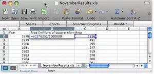
- Add a new column between Columns A and B. Enter a label in the top cell of the new column (cell B1). Type "Area (millions of square kilometers)."
- Enter this formula in cell B2: =(C2*625)/1000000
This will multiply the area in C2 (the number of pixels covered by ice) by the area of a pixel (625 km2) and divide by 1 million. The result will be the total ice extent (area) in millions of km2.
- Copy this formula down Column B.
- Format the cells as numbers, and limit them to two decimal places.
- Save your edited Excel file.

Step 3 – Show the Trend in the Data
What do the data say? Is the sea ice extent really getting smaller in November of each year? Is it true that polar bears are having to wait longer for the ice to return to Hudson Bay? Graph your data to document your answer to this important question.
- Select the Year and Area (millions of km2) columns (columns A and B) then click the Chart Wizard icon or choose Insert > Chart... from Excel's menu bar.
- Make an XY (Scatter) graph with points and smooth lines (called a Smooth Marked Scatter). Place Time (in years) on the X axis and Sea Ice Extent (in millions of square kilometers) on the Y axis.
- Add a linear trend line to your graph. Click once on the line of graphed sea ice area data to select it, then choose Chart > Add Trendline.... In the Format Trendline dialog box, choose Type and select the Linear line option. Click OK.
- What does the general slope of your trend line say about sea ice in Hudson Bay since 1979? Describe the relationship shown by your trend line. At the rate of decline shown by your chart, how much ice would you predict will be in Hudson Bay in November, 50 years from now?
- With your chart active, re-open the Format Trendline window, click on Options. Use the Forecast tools, to project your trend line into the future. Set the Forecast field to go Forward by 50 Periods (years).
Note to Numbers software (Mac) users: you can use the Forecast function to predict the Sea Ice Extent in the year 2050. - Experiment with the trend line options. Predict the year that there will be no sea ice at all (0 square kilometers) in November.

The trend that the students find is astonishing. They decide that they will meet with the elders and discuss their findings. They prepare presentations and call a meeting for the next afternoon.
Step 4 – Save your Excel Spreadsheet and Graph.
- Select and copy your graph. Create a new word processing document and paste the graph into it so you can compare it with the graph you make in the next section.
- Save your worksheet and graph in the Excel file by choosing File > Save As... and giving it an appropriate name. Save your file in the folder with the other work for this project.


