
Part 2—Explore Core Data
Step 1 – Launch GeoMapApp and Import Data
Launch GeoMapApp by double clicking the icon on the dock (Mac) or start menu (PC)- Take a moment to examine the start screen, shown below. Notice how the Mercator projection to the left distorts Antarctica. Cartographers have struggled for centuries to depict our spherical world on chart paper. Their best solutions have been ones that have the least distortion in the area of interest. Mercator has the least distortion near the equator but maximal distortion near our area of interest, Antarctica. For this part of our investigation you will use the South Polar Projection in order to minimize the distortion of the map.
- Select the South Polar Projection in the center of the box and click Agree. In this activity you will learn to upload your own data into GeoMapApp.
- If needed, launch Microsoft Excel and open the spreadsheet table that you downloaded in Part 1.
- Highlight and copy the entire table to your clipboard. Make sure that you copy the column headers as they will be used in GeoMapApp. Minimize Excel.
- In GeoMapApp select File > Import Table or Spreadsheet > From Clipboard...
(Note: If you have a saved Excel file you have the option to select From Excel-formatted file... in this same menu.) - The Excel file you copied to your clipboard should now be pasted directly into the highlighted box as follows:

![[creative commons]](/images/creativecommons_16.png)


- Click Ok located below the table; you will see the Configuration window.
- Notice that the latitude and longitude columns you loaded will automatically be used as the GeoMapApp latitude and longitude values. Any future tables you want to load must have columns of latitude and longitude for location reference. These coordinates must be in decimal form.
- In the Configuration window, click Ok to go ahead and load the data, and you will see the following map and table.


Step 2 – Manipulate Symbol Size and Color
The uploaded table now appears on the GeoMapApp dock at the bottom of the screen and the core coordinates have been loaded into the map as round grey-colored icons. Note their location, just off the tip of South America and near the Antarctic Peninsula.- Zoom into the area where the core icons are located using the Zoom tool until you see 4 separate dots, one for each core sample.
- Deselect the Zoom tool and select the arrow Pointer from the toolbar above the map. Click one of the core icons with the Pointer tool. Note how the data table is highlighted showing you the data from that core location.
- Next, you will manipulate the symbols to enhance image. First, you will color-code the symbols by average age (ave age). To change the symbol color, use the Pointer tool to select the Color tab to the right, on the vertical Tool Box. You should see a screen like image pictured below.
- Click the arrow to the right on the Select Column box to open the dropdown menu. Select ave age and then click OK. You will see the core locations sorted by age along with a histogram that shows how color relates to age. Examine the image and answer the questions below.

- What do you notice about the pattern of age distribution in relation to distances from the nearest shoreline of the Antarctic Peninsula?
Step 3 – Measure the Distance from the Shore to the Core
- Use the Distance / Profile tool from the top toolbar to determine the distances from the core sites to the Antarctic Peninsula shoreline. While observing the map, note the water depth as well as the map colors.
Notice how the depth numbers at the top right above your map window change as you move the cursor along the transect depicted on the graph. You may find that these values shift quite suddenly as you "cruise" along the transect. What is going on? The seafloor can be quite irregular for starters. Millions of years worth of sediment has rained down from ice bergs and been reworked by tectonic forces. You should also consider how the data is "smoothed" by the graphing program. Finally, although we strive for accurate depth and distance values one can only obtain them when working precisely with the measurement tool.
- Answer the following questions about the cores.


- How far is it from the shoreline to the oldest core?
- How deep is the water at the oldest core location?
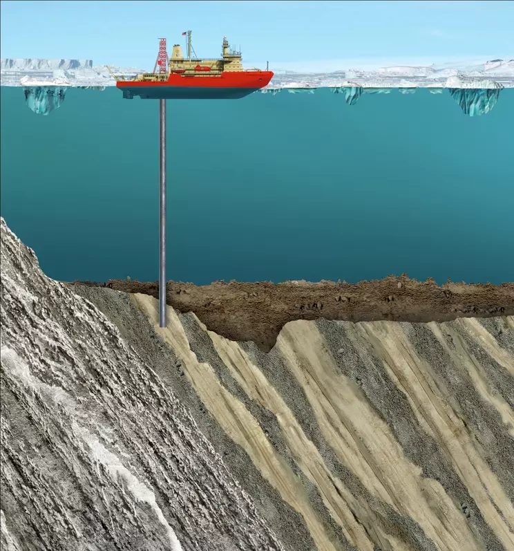 Artists rendering of the SHALDRIL operation at Eocene Site NBP0602A-3C. The subsurface sediment is depicted as seen on seismic profiles collected by Dr. John Anderson at Rice. Created by artist Angie Fox (University of Nebraska, Lincoln) and scientist Sophie Warny (LSU).
A layer cake analogy may help you understand how the sediment layers are arranged off the Antarctic Peninsula. First, recall that for undisturbed sediment the oldest layers will be found at the bottom just as the bottom layer of an uncut birthday cake was the first part to be placed on the plate. As time passes additional sediment layers are added. This is analogous to putting on a thin smear of frosting followed by the next layer of cake and so on. Geologists call this the "Law of Superposition." Sometimes, however, tectonic forces may alter the layers from their original position. Imagine you cut your birthday cake and place a slice on its side. Now as you move your fork horizontally across the slice you will see all layers exposed and can easily sample bites from different times of the cake's making. In the same way researchers can move outward form the Antarctic Peninsula and sample different slices of Earth's history!

![[reuse info]](/images/information_16.png)
- Which core has the greatest abundance of Nothofagidites fusca? How do you know?
- In your journal, describe the trend of species abundance over time. Save the screenshot and paste it into your journal to use in your report.
Step 4 – Create Graphs with GeoMapApp
Although you can determine the relationships with your map, you can also create graphs using the data you uploaded.- Use the pointer tool to select the Graph button from the Tool Box at the right. Follow the prompts to select average age as your x-axis and Nothofagidites fusca as your y-axis. You can select either line or scatterplot, depending on your preference. Note the line graph has a trendline about the data points.
- Copy the graph and paste it in your working file or a word-processing document. Make sure to give the graph an appropriate descriptive title and a caption explaining what the figure shows.
- You may want to try these techniques with other conifer pollen listed in the data set to identify similarities and differences among the two taxa.

Step 5 – Find the Nearest Living Relative
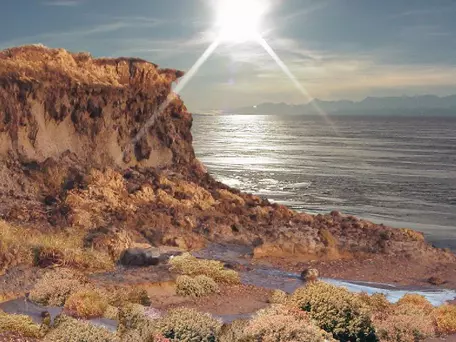 This artist's rendition created from a photograph of Antarctica shows what Antarctica possibly looked like during the middle Miocene epoch, based on pollen fossil data. Photo courtesy of NASA/Dr. Philip Bart, LSU.
Use the Internet to research and write a brief description of Nothofagus fusca and where it is found today. Answer the following questions:
- What can you infer about the climate of the Antarctic Peninsula 34 million years ago based on the presence of Nothofagus pollen?
- Briefly describe the evolution of Antarctica's climate from 34 million years ago to the present. Be sure to cite relevant evidence to justify your conclusion.


