Part 2: Analyze Population Variables
Step 1 –
Identify Variables
NOTE: This chapter was retired from the EET collection after CIESIN's Demographic Data Viewer became unavailable. The pages are available here for reference.
Analyzing population data is one way we can better understand geographical regions. The characteristics of populations are often recorded in tables which can then be mapped or graphed. We call these characteristics variables because they change from population to population. You may be familiar with variables from previous work designing and conducting science experiments.
- What variables might help you to better understand the similarities and differences between regions, states, or counties?
The US-Mexico Demographic Data Viewer can map a variety of variables, including the percentages of people of different ages, birth rates, death rates, land type, and the makeup of households.
Step 2 –
Select Variables
Click Select Vars. Make sure the Population button at the top left of the Sel Vars window is clicked then select these three variables: % Persons 0-19 years of age (pctAGE0_19), % Persons 20-64 years of age (pctAGE20_64), and % Persons 65 years and up (pctAGE65_up)
The % symbol means percent or per 100. Representing values as percentages enables proportional comparisons among groups. For example, the variable, "% Persons 0-19 years of age", is the percent of persons whose ages range from 0 to 19. Notice that this variable has the name "agePCT0-19".
- Click Select Vars. A new window will open.
- Make sure the Population button is clicked.
- In the Select Variable window, slide the scroll bar down in the box containing the list of Variable Names and Variable Descriptions. Choose three variables: % Persons 0-19 years of age (pctAGE0_19), % Persons 20-64 years of age (pctAGE20_64), and % Persons 65 years and up (pctAGE65_up). Make sure they appear in the Select Mapping Variable box,then click close.

Step 3 –
Conduct Regional Analyses
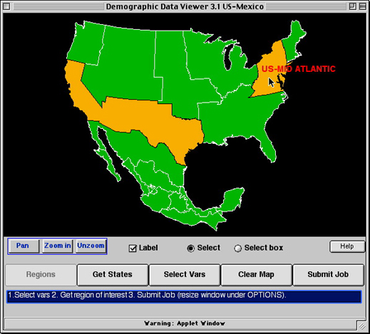
Click the Demographic Data Viewer window to make it active. Click the Regions button to return to the regional view. Select the US-Border region and the US-Mid Atlantic region. Click Submit Job.
After the map loads, click each region to view population statistics in the Point Identification window. To switch back and forth between the maps for each age range, click the mapped variable in the window at the lower right. To compare the data for all three age ranges at once, click Statistical Info and then click the Tabular Info button.
Since the variable, agePCT0-19 refers to the percent of persons from 0 to 19 years of age, the value of 30.09256, in the US-Border column, for the variable, agePCT0-19, means that over 30% of the persons recorded in the US-Border region were within the 0 to 19 age range.
- Compare the two regions for each age group. Which region has a higher percentage of older people? Which region has a higher percentage of children?
- After selecting the variables, click on the Demographic Data Viewer window to make it active.
- Click the Regions button to return to the regional view.

- Select the US-Border region and the US-Mid Atlantic region by clicking on each one.
- Click Submit Job.

- This produces three color-coded maps showing the percent of the population ages 0-19, 20-64, and 65 and up in the two regions. To switch back and forth between each map, click the mapped variable (pctAGE0_19, pctAGE20_64, pctAGE65_up) in the scrollable window at the lower right.

- Click each region to bring up population statistics in the Point Identification window or move the cursor over each region to view the same data. Minimize or move the larger window if the Point Identification window does not appear after clicking the region.

- To see the data of all three maps, click Statistical Info. A new window will open. Select the Tabular info button to view the raw data as a list.

Step 4 –
Conduct State Analyses
Comparisons at the regional level aren't always informative, because the data from many areas is lumped together. Comparing populations of smaller areas such as states can reveal differences in population ages that don't show up in regional maps.
To view the data by states in each region, click Sel New Area to return to the opening North America view. Highlight both the US-Border and US-Mid Atlantic Regions, then choose Get States. Next, use the Select box to drag and drop and highlight all the states in both regions. Click Submit Job to create maps using the same variables as before. View the data as a table by clicking Statistical Info and then clicking the Tabular Info button.
- Which states have the highest and lowest percentages of young, middle-aged, and older people?
- Compare states from each region, specifically New Mexico and New York.
- Click Sel New Area to return to the opening North America view.
- Highlight both the US-Border and US-Mid Atlantic Regions, then choose Get States.
- Click the Select box button, then, from one corner, drag and drop diagonally to highlight all the states in both regions.

- Click Submit Job to create maps using the same variables as before.

- This produces three color-coded maps showing the percent of the population ages 0-19, 20-64, and 65 and up for the states displayed. To switch back and forth between each map, click the mapped variable (pctAGE0_19, pctAGE20_64, pctAGE65_up) in the scrollable window at the lower right.

- View the data as a table by clicking Statistical Info and then clicking the Tabular Info button.

Step 5 –
Conduct County Analyses
Making a county level map can reveal further differences in the distribution of populations within states.
Click Sel New Area to return to the map showing the states of the US-Border and Mid Atlantic regions. Click on New Mexico and New York to choose these states. Click Get Counties. Use the Select box to highlight all the counties shown on the map. Click Submit Job to create maps using the same variables as before. View the data as a table by clicking Statistical Info and then clicking the Tabular Info button.
- Compare the three variables across the counties of New Mexico and New York. Identify the counties with the highest percentages of older and younger people.
- How similar or different are Hidalgo County in New Mexico State and New York County in New York State?
To map the variables across all the counties in the two regions, use the select box and click and drag to highlight all the states before clicking Get Counties. Clicking only one or two states, such as New Mexico and New York, before you click Get Counties will produce maps that show only the counties in those states.
- Click Sel New Area to return to the map showing the states of the US-Border and Mid Atlantic regions.

- Click on New Mexico and New York to select these states.

- Click on the Get Counties button to see the distibution of each's states counties.

- County boundaries will be displayed for the selected states.

- Click the Select box button. Highlight all the counties in both states by clicking in the uppermost left corner of the map and dragging the cursor diagonally across the map. Make sure that the box you draw surrounds both states.

- Click Submit Job to create maps using the same variables as before.

- This produces three color-coded maps showing the percent of the population ages 0-19, 20-64, and 65 and up for all counties in the two states. To switch back and forth between each map, click the mapped variable (pctAGE0_19, pctAGE20_64, pctAGE65_up) in the scrollable window at the lower right.

- View the data as a table by clicking the Statistical Info button and selecting the Tabular info button.

Step 6 –
Continue Analyses with Other Variables
Click Select Vars, to choose other variables for analysis. Repeat Steps 3, 4, and 5 for those variables. Focus your comparisons on:
- the US-Border region versus the US-Mid Atlantic region
- New Mexico State versus New York State
- Hidalgo County versus Kings County

