
Part 4—Generate Temperature Maps Using EVA
Step 1 – Launch EdGCM
- Launch EdGCM by double clicking on the icon in the EdGCM folder, the application will load. The toolbar window will appear. This toolbar window is the controller for the software. The buttons will change depending on your active window.
- In this window, choose Modern Predicted SST in the toolbar Run List. This is the baseline for the model. In this simulation scientists have used our present climatic conditions in order to demonstrate the future climate trends with no change in present greenhouse gases or other variables, such as solar luminosity. This is the baseline for comparison with the experimental IPCC_A1_FI simulation in which greenhouse gases and other conditions have been changed according to the IPCC A1_FI scenario. These scenarios are described in detail in Part 1.

Step 2 – Generate a Map
- Launch the Analyze Output feature of the EdGCM, by clicking on the button on the top of the toolbar. Or use the drop down window menu.
- Click on the maps tab.
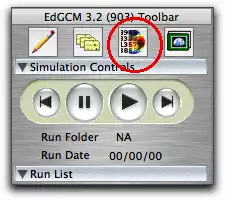 Toolbar window
 Step 3 – Prepare Output for Analysis
- On the left hand side of the Analyze Output window, choose the last five years by clicking on the last 5 button.
 Alternately, manually select the years of your choice. Note: Using a group of five or more years helps to smooth out some variables that may differ a lot from year to year.
 - Once the years have been selected, click the Average button at the bottom of the list.
 This creates an average of all variables from the last 5 years of the simulation. A window opens as the files are "post-processed". This step may take up to a minute to complete. Note: if this step has already been completed the button may be grayed out (in-active)
 - In the center section of the Analyze Output window select from the following variables by clicking on the checkbox next to each of the following:
- snow and ice coverage
- precipitation
- evaporation
- low level cloud coverage
- surface air temperature (in C)
- max surface air temperature (in K)
- Check the Monthly Seasonal and Annual check boxes at the bottom of the Analyze Output window.

- Click on Extract button, you will see a window open, which shows that another post-processing program is running.
- Under View Images, select the 2096-2100ij.nc file, then click the View button at the bottom right of the window.
 EdGCM's Visualization Application, EVA, will launch. Ignore it for the moment.
 - Repeat numbers 1-6 from above for IPCC_A1FI_CO2 simulation. Now both files are listed in the EVA data browser window under the file header.
When complete, the year range 2096-2100 will appear in the Averages list in the lower right corner of the window. Make sure this is selected by single clicking on it.

Step 4 – Generate Temperature Maps
- Use the shift key to select the Modern_PredictedSST and the IPCC_A1FI_CO2 files in the left column of the EVA data browser. Then select Surface Air Temperature in the center and Annual in the right column.
- Click the Plot All button. The software will generate two maps:
Modern_PredictedSST Surface Air Temperature and IPCC_A1FI_CO2 Surface Air Temperature.
- The maps need to be interpolated, or smoothed. To do this click the "interpolate" check box in the toolbar next to each map (it is near the top of the toolbar)


Step 5 – Finalize the Maps
- Click on the Projection menu under map heading in on the toolbar. Use the pulldown menu to change the projection to Mollweide.
- Change the range shown on the Color bar /scale so that the minimum is -45C and the maximum is +35C on both maps. This will give you the same end points on the color bars of both plots.
- Add overlay modern with USA for both maps. Optional:Explore other overlay options.
- When you are done, save your maps to use in the next part of the lesson.
- Answer the following questions about your maps:
- What areas of both maps are the warmest? coolest?
- Describe how the two maps are alike and different. In particular, focus on the Polar and equatorial regions.
 Map toolbar highlighted
Step 6 – How will Global Warming gases Effect Temperatures?
- In EVA's Data Browser, subtract the control run, Modern_predictedSST, from the climate change experiment (IPCC_A1FI_CO2) using the differencing drop down menu.
- Adjust the Color Scale. Use the map toolbar and click on the colorbar to choose a new color scale, such as panapoly_diff.pa1, click center on zero. If necessary "flip" the color scale using a checkbox in the map's toolbar to make the hottest temperatures appear in red.
- Answer the following questions about your map:
- What regions show the greatest increase in temperature?
- Do any regions show a decrease in temperature?
- Why do you suppose the greatest temperature increases are over the continents rather than the oceans?


