Cumulative percent graphs: Teaching the hypsometric curve and more
Quantitative concepts: Graph Reading, Basic Graphing Skills, Why do geologists use graphs?
Cumulative percent graphs: Teaching the Hypsometric Curve/Graph and other similar plots
by Dr. Eric M. Baer, Geology Program, Highline Community CollegeJump down to: How to read | What the graph shows | Why is this important? | Advanced skills
Essential Concepts

Generally there are some main concepts that our students struggle with when encountering cumulative percent graphs
- how to read cumulative percent graphs including the hypsometric graph,
- the importance of the hypsometric graph and what it shows,
- disregarding extraneous information on the graph, and
- reading and interpreting the hypsometric graph more deeply, including interpreting the slope and looking at other cumulative percent graphs.
Teaching students how to read a cumulative percent graph
Cumulative percent graphs can be challenging to students. It is unlikely that they have seen anything like these plots before - they are not a single line from which to generate a set of data. Often, the plots also have significant amounts of extraneous data which can distract students. As geologists, we encounter these types of plots in many situations, from sediment size distribution to the naming of igneous rocks.
However, it is important to keep the basic concepts in mind when teaching to students:- Cumulative percent graphs are a way of showing a distribution.
- The bottom of the graph (the y-axis) is almost always percent, going from 0-100%.
- Because this is a cumulative percent graph, the curve always trends in one direction; as a result, it is the slope that is critical to reading this graph.
- the median is the value at the 50% mark.
The hypsometric graph/curve as an example of a cumulative percent graph
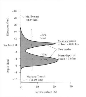
The hypsometric graph (also called the hypsometric curve) is a terrific diagram to begin exploring cumulative percent graphs. It allows an instructor to start simple and then get more complicated, and has significance that most students can recognize. Indeed it is often included in textbooks in the Earth sciences, oceanography, and astronomy. This diagram shows what percentage of the Earth's surface is above (or below) a certain elevation (given on the vertical axis). The horizontal scale (on the bottom) shows the cumulative percentage of the Earth's surface. For instance, the highest point on Earth is about 8 km above sea level. Therefore none of the Earth is above that elevation, and at 8 km elevation the hypsometric curve is at 0%. Reading from the graph tells us that about 29% of the Earth's surface is above sea level, and 95% of the Earth's surface is higher than 6 km below sea level.
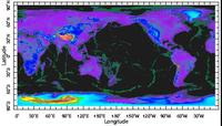
 Bathymetric map of the Earth with all elevations below 3 km blackened. 47% of the globe remains colored. You can create your own maps with any elevation blacked out.
 At first, I begin with simply reading individual points off the graph. Then I ask students to look at what percentage of the Earth's surface is below a given elevation. Finally, I ask students to look at elevation ranges, for example, what percentage of the Earth's surface is below 1000 m elevation but above sea level.
Why should I care about this graph?
I use the hypsometric graph in many of my classes because it gives evidence that there are two kinds of crust on Earth and it is important that students understand why we interpret that the Earth has continental crust and oceanic crust. I also point out that this graph shows rather surprising information - while there is a great range in elevations on the Earth, 85% of the Earth's surface falls into two narrow bands of elevation - from 2000m above sea level to 500 m below sea level and from 3000m below sea level to 6000m below sea level.
Added on features can lead to mis-understandings
Often cumulative  percent graphs have a great deal of extraneous information added to them which can cause students to misunderstand or be distracted from the point of the graph. As an example, in the hypsometric curve shown above from Marshak (2005), the illustrator has chosen to fill in below the curve. This has no significance, and can even cause students to confuse the graph with a diagram of the features of a passive margin. The bar at the top assists in this confusion, since it seems to be labeling parts of the graph features of the ocean floor as does the coloring of all areas above the curve but below sea-level blue. Another common error in textbooks is to convert this graph into a histogram (as is shown to the left) but then to smooth the bins. This is very confusing, because you can add up all the points on the graph and they will exceed 100%. True histograms cannot be smoothed, although one can plot a smoothed curve if one changes the axis to %/km and then use calculus to have the bin size approach zero.
What can I do beyond this?
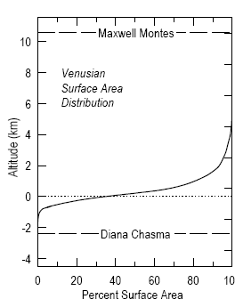
 The hypsometric graph of Venus from Planetary Chemistry Lab at Washington University adapted from Fegley and Treiman (1992).
 When graph reading is an essential outcome of a course, I will often have students examine the significance of the slope of a line on a cumulative percent graph. I might do this by having them pick out breaks in slope and look at the distribution of elevations on Earth. They quickly find out that, despite the large range of elevations on Earth, 85% of the Earth's surface is in two narrow bands. I usually try to express the surprising nature of this result by making the analogy of having a class of students whose heights ranged from 4 feet to 7 feet, but a third of them were all 5'5"-5'6" and half were 5'11"-6' tall. We then examine the slope of the graph and see that the steeper the slope in a cumulative percent graph, the more common/greater frequency.
Another way of challenging students is to examine the hypsometric curve of another terrestrial planet, such as Venus. Mars, the Moon and Venus all lack the bimodal distribution of elevations that we have on Earth. As a result, they are not interpreted to have 2 different types of crust and plate tectonics is less likely.
Finally, there is a great deal more information to be gleaned from the hypsometric graph. For instance, the slope of the lower linear area represents the drop in elevation of oceanic crust as it moves away from the mid-ocean ridge and cools. The upper bound of this linear segment is the elevation of the top of the mid-ocean ridges.
Teaching resources and examples
- A lab where students generate a cumulative graph plot from sediment data using EXCEL and analyzing several statistical properties of distributions. From Brian Lewis in the University of Washington Oceanography Department.
- In a Historical Geology lab students use a cumulative percent plot to get statistical information for a wide range of sands and sediments. I found this lab, used at Georgia Perimiter College, to be an excellent introduction with very clear directions.
Student Resources
- Annanberg learner learning MATH telecourse includes student instruction on distributions and representing distributions. There are sample problems and more. This is meant as a source to help students teach themselves how about distributions and representing distributions.


