Initial Publication Date: October 19, 2006
DOIThis page currently has no DOI, but you may request a DOI be assigned. |
Cite thisPart 6 - Create a Variation Diagram
In any step, click the 'Show me' link to reveal extra information. A sequence of 'Show me's indicates a series of steps. If you prefer a printout of the full set of instructions for this part, choose Print from the File menu.
These instructions will walk you through the basics of X-Y plotting in Excel, using a plot of SiO
2 vs. MgO as an example. If you are already familiar with how to do this, skip ahead to
Part 7.
Step 1 - Select Data and Open the Chart Wizard
-
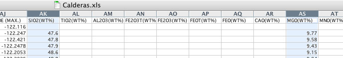
1. In the Crater Lake worksheet, highlight the SiO
2 and MgO columns. Two nonadjacent columns can be highlighted by using the cmd key (on a PC) or the Apple key (on a Mac).
2. Open the Chart Wizard by clicking on its icon in the Excel toolbar.

Step 2 - Select the Chart Type
Select the graph type
X-Y (Scatter). Click
Next.
-
Step 3 - Label the Crater Lake series
Choose the
Series page, and label the Crater Lake series as
Crater Lake. Click
Next.
-
Step 4 - Add the Yellowstone series to the graph
-
Click
Add and name the new series 'Yellowstone'. If you don't want to type in the cell references for the X and Y values, you can click on the up-arrows (at the right); then go to the Yellowstone worksheet, drag on the X values (but not the entire column this time--doing this creates an error!), and click on the shaded down-arrow to return to the Series page. Repeat for the Y values.

Step 5 - Label the Axes
Enter 'SiO
2 (wt.%)' for the Value (X) axis and 'MgO (wt.%)' for the Value (Y) axis. Click
Next.
-
Step 6 - Remove those unsightly gridlines
Choose
Gridlines, and remove the major gridlines along the Y-axis. Click
Finish.
-
Step 7- Modify the Graph for Easier Reading
Re-size the graph to an appropriate size. Change the fonts for the axes and legend titles so that they are readable for the new graph size. Rescale the axes to fit the range of the data.
-
1. Drag any of the eight handles you see around the perimeter of the background to re-size both the background and the graph area. You can also select just the graph area and re-size it in the same way, so that the graph fills more of the background area.
2. Drag the Legend, which shows the symbols for the Crater Lake and Yellowstone series, onto the upper right corner of the graph.
3. Change the font sizes of the axes and legend titles so they are readable.
4. Consider reducing the size of the data symboles, especially if there are lots of them. Do this by clicking directly on a datapoint from one of the plotted series.
5. Finally, choose an appropriate scale for the axes. This is done by clicking on either the X or Y axis and modifying its minimum and/or maximum value. For this particular graph, an appropriate range for the X-axis would be 40-80 wt.% SiO
2.
Here's the finished product...


