Part 2—Prepare and Graph Daily Data for One Station
Step 1 – Open and Examine Global Summary of the Day (GSOD) Temperature Data
- Use the Excel Import Wizard and import the BarrowGSOD.txt file into an Excel workbook.
- Launch Excel, choose File > Open, navigate to the Barrow, Alaska GSOD text file you downloaded in Part 1, and open it. In the Open dialog box, display all files, not just .xls files. In Step 1 of the Text Import Wizard, choose Delimited and click Next.
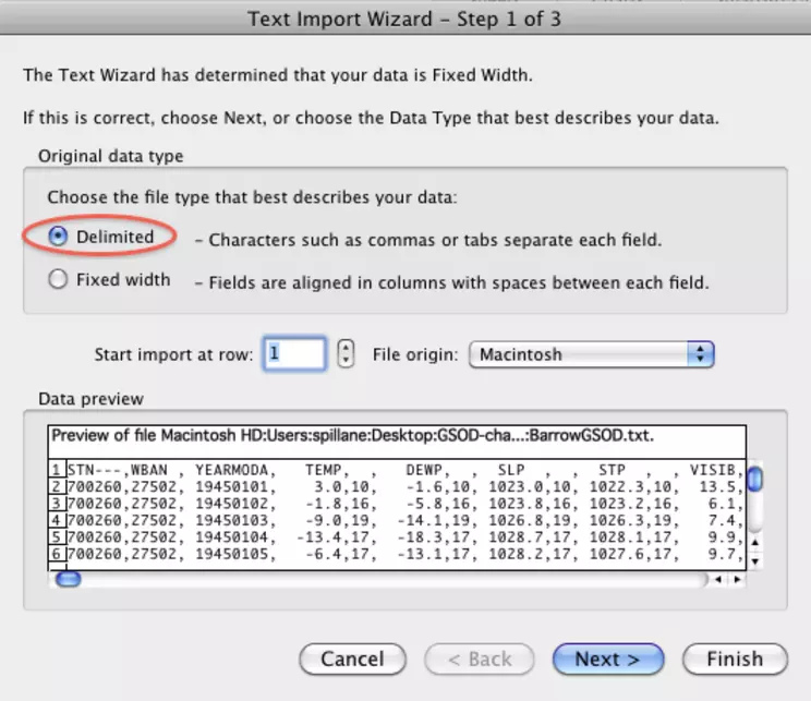
Excel Open Wizard - step 1 box - delimited
![[creative commons]](/images/creativecommons_16.png)
Provenance: Rita Freuder, University of New Hampshire-Main Campus
Reuse: This item is offered under a Creative Commons Attribution-NonCommercial-ShareAlike license http://creativecommons.org/licenses/by-nc-sa/3.0/ You may reuse this item for non-commercial purposes as long as you provide attribution and offer any derivative works under a similar license.
[
- In Step 2 of the wizard, check both the Comma and Other delimiters and enter an asterisk (*) in the Other field. Click Next.
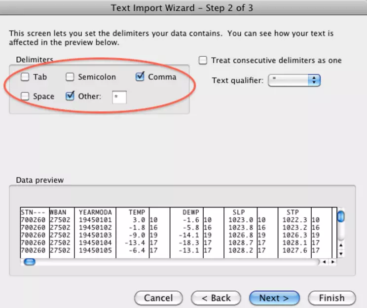
Excel open wizard - choose comma separator and asterisk in other
Provenance: Rita Freuder, University of New Hampshire-Main Campus
Reuse: This item is offered under a Creative Commons Attribution-NonCommercial-ShareAlike license http://creativecommons.org/licenses/by-nc-sa/3.0/ You may reuse this item for non-commercial purposes as long as you provide attribution and offer any derivative works under a similar license.
- In Step 3, click Finish to import the data into an Excel Workbook. Choose File > Save As, and save the file in Workbook format with a name that clearly identifies the data, such as BarrowTempsGSOD.xls .
- Briefly look over the data. Scroll across and down the workbook to view the column headers and data values. The first two columns contain the station IDs and column three shows the date. The mean temperature for the day in degrees Fahrenheit is in the fourth column. Other columns show dew point, barometric pressure, visibility, wind speed, maximum and minimum temperature for the day, precipitation, snow depth, and so on. The code in the last column is a weather indicator for things like fog, hail, or tornadoes. As shown in Part 1, Step 3, the data format description file that accompanies each order describes each field and the units of measure used.
Step 2 – Make a Worksheet With One Year's GSOD Temperature Data
A good way to visualize the temperature changes over a year is to graph the data. Start with 1946 because 1945 does not have a full 365 days of data. For comparison, you will also graph 2010 data. The dataset includes thee reported temperatures—the average of all the readings in a day, the daily minimum temperature, and the daily maximum temperature.
- Choose View > Normal to make the worksheet display as shown in the examples.
- Choose Insert > Sheet > Blank Sheet (or Insert > Worksheet in older versions of Excel) to add a new sheet to the workbook. Label the new sheet "Graphs."
- Choose Insert > Sheet > Blank Sheet (or Insert > Worksheet in older versions of Excel) to create a new sheet. This is where the 1946 and 2008 data and graph will go.
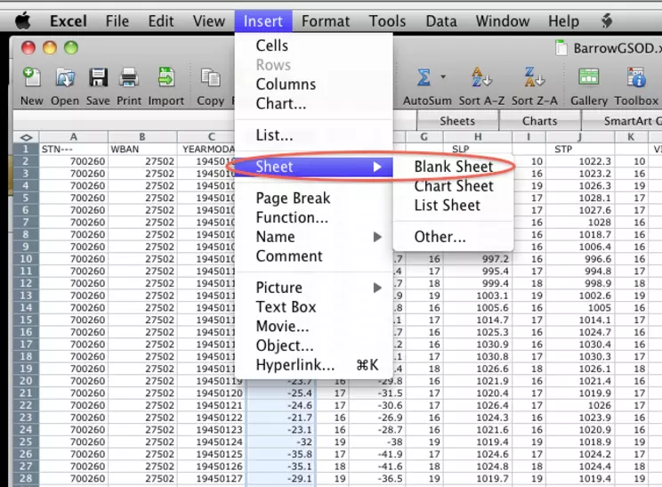
Where on Excel menu - Insert ->Worksheet
Provenance: Rita Freuder, University of New Hampshire-Main Campus
Reuse: This item is offered under a Creative Commons Attribution-NonCommercial-ShareAlike license http://creativecommons.org/licenses/by-nc-sa/3.0/ You may reuse this item for non-commercial purposes as long as you provide attribution and offer any derivative works under a similar license.
- To change the name of this sheet from "Sheet 1" to "Graphs," double-click the tab at the bottom of the Excel window and enter the new name.
Default worksheet name - replace with double click on tab
Provenance: Rita Freuder, University of New Hampshire-Main Campus
Reuse: This item is offered under a Creative Commons Attribution-NonCommercial-ShareAlike license http://creativecommons.org/licenses/by-nc-sa/3.0/ You may reuse this item for non-commercial purposes as long as you provide attribution and offer any derivative works under a similar license.
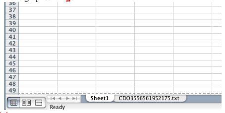
- To switch between sheets in an Excel workbook, click the tabs at the bottom of the window. The main data tab with all the columns is labeled "CDOxxxx.txt" (or whatever name you gave the data file before loading it into Excel). The blank sheet is named "Graphs."
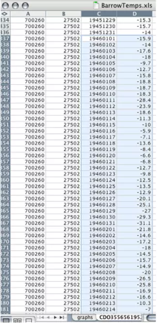
- Copy the 1946 date and average temperature data from the original data sheet to the graphs sheet.
- On the original data tab, scroll down Column C to 19460101 (January 1, 1946). Click cell C337 and drag down to cell D701 (19461231 or December 31, 1946) and choose Edit > Copy.
Shows the default tab name and where it is
Provenance: Rita Freuder, University of New Hampshire-Main Campus
Reuse: This item is offered under a Creative Commons Attribution-NonCommercial-ShareAlike license http://creativecommons.org/licenses/by-nc-sa/3.0/ You may reuse this item for non-commercial purposes as long as you provide attribution and offer any derivative works under a similar license.
- Click the tab for the graphs sheet. Click cell A2 and choose Edit > Paste to paste the copied data into columns A and B. This saves room in the first row for labels. After pasting in the 1946 data, the graphs sheet looks like this:
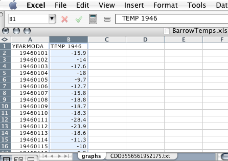
- Label column A Date and column B Mean_Temp_1946.
- Repeat this process to copy the Max temperature (column R) and Min temperature (column T) data for 1946 from the full data sheet to columns C and D of the graphs sheet, again leaving room for headings in Row 1.
- Label column C Max_Temp_1946 and column D Min_Temp_1946.
- Go back to the full sheet tab and scroll down to row 23710 (Jan 1, 2010 or 20080101). Click cell D23710 and drag down to cell D24074 to select the 2010 mean temperature data, and choose Edit > Copy.
- Click the graphs tab, paste the 2010 data into cell E2, and label the new column Mean_Temp_2010.
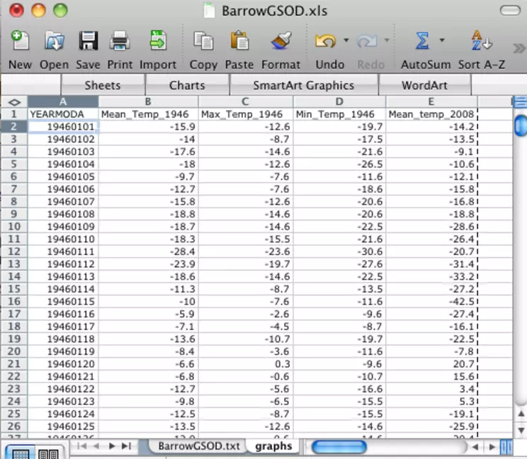
After a copy and paste operation for 1946 GSOD temp data and 2008 mean temp data
Provenance: Rita Freuder, University of New Hampshire-Main Campus
Reuse: This item is offered under a Creative Commons Attribution-NonCommercial-ShareAlike license http://creativecommons.org/licenses/by-nc-sa/3.0/ You may reuse this item for non-commercial purposes as long as you provide attribution and offer any derivative works under a similar license.
If you had trouble downloading data or creating the graphs sheet, download the barrow_part2_step2.xls (Excel 7.4MB May30 11) file to use for the rest of the investigation. Right-click (PC) or control-click (Mac) the link to download the file.
Step 3 – Graph a Year of GSOD Mean Temperature Data
- Create a line graph of the 1946 mean temperatures using the Excel chart wizard.
- Select the Mean_Temp_1946 column.
Excel graphs worksheet with the header and data selected for chart wizard
Provenance: Rita Freuder, University of New Hampshire-Main Campus
Reuse: This item is offered under a Creative Commons Attribution-NonCommercial-ShareAlike license http://creativecommons.org/licenses/by-nc-sa/3.0/ You may reuse this item for non-commercial purposes as long as you provide attribution and offer any derivative works under a similar license.
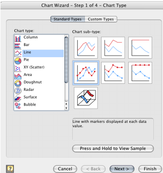
- Choose Insert > Chart. A wizard provides a series of windows to set up the graph. In the first window, choose "Line" graph.
highlighted cols for line chart
Provenance: Rita Freuder, University of New Hampshire-Main Campus
Reuse: This item is offered under a Creative Commons Attribution-NonCommercial-ShareAlike license http://creativecommons.org/licenses/by-nc-sa/3.0/ You may reuse this item for non-commercial purposes as long as you provide attribution and offer any derivative works under a similar license.
- In the Step 2 window, click the Series button. Verify the name of the series – "Mean_Temp_1946". Click Next.
- In Step 3, enter the chart title "Barrow AverageTemperature 1946". Label the X-axis "Day of Year" and the Y-axis "degrees F". Click Next.
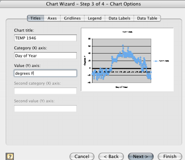
user enters title and axes labels
Provenance: Rita Freuder, University of New Hampshire-Main Campus
Reuse: This item is offered under a Creative Commons Attribution-NonCommercial-ShareAlike license http://creativecommons.org/licenses/by-nc-sa/3.0/ You may reuse this item for non-commercial purposes as long as you provide attribution and offer any derivative works under a similar license.
- Click Finish in the Step 4 window and the graph will display on the graphs worksheet.
- Your resulting graph should look something like the one shown below.
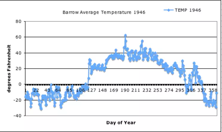
A single year of Barrow av temp data
Provenance: Rita Freuder, University of New Hampshire-Main Campus
Reuse: This item is offered under a Creative Commons Attribution-NonCommercial-ShareAlike license http://creativecommons.org/licenses/by-nc-sa/3.0/ You may reuse this item for non-commercial purposes as long as you provide attribution and offer any derivative works under a similar license.
Step 4 – Graph a Year of Mean Daily Temperature and Daily Max and Min Temperatures
- Select the data in the Mean_Temp_1946, Min_Temp_1946, and Max_Temp_1946 columns and use the chart wizard to make a new line graph as you did in Step 3. The final graph should look like the one below.
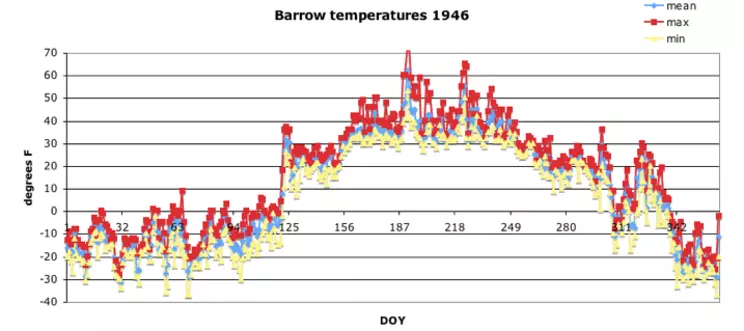
Three cols plotted min, max, mean daily temps Barrow, AK
Provenance: Rita Freuder, University of New Hampshire-Main Campus
Reuse: This item is offered under a Creative Commons Attribution-NonCommercial-ShareAlike license http://creativecommons.org/licenses/by-nc-sa/3.0/ You may reuse this item for non-commercial purposes as long as you provide attribution and offer any derivative works under a similar license.
- Look at the graphs of annual temperature. What do you notice? Are there days when the sun does not shine? Are there times of the year when the temperature extremes (min to max) are greater? Is this easier to see on this graph or in the Excel spreadsheet?
If you graphed several years of data one after the other, the graph would show a cycle, repeating the up and down pattern year after year. Barrow definitely has days in the winter when the sun does not rise. However, once the sun does rise, the difference between the maximum and minimum temperatures increases significantly.
Step 5 – Graph Mean Daily Temperature Data for 1946 and 2010
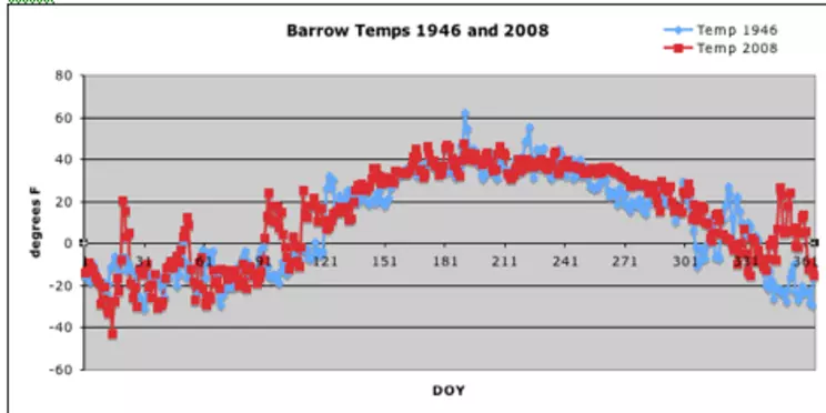
- Use the chart wizard to create a line graph of the Mean_Temp_1946 and Mean_Temp_2010 data. The result should resemble the graph pictured below. Note: the years in the pictured graph are not the same as the graph you have created.
resulting chart
Provenance: Rita Freuder, University of New Hampshire-Main Campus
Reuse: This item is offered under a Creative Commons Attribution-NonCommercial-ShareAlike license http://creativecommons.org/licenses/by-nc-sa/3.0/ You may reuse this item for non-commercial purposes as long as you provide attribution and offer any derivative works under a similar license.
On the graphs sheet, click the column B (Mean_Temp_1946) header to select the 1946 data. Control-click (PC) or command-click (Mac) the column E (Mean_Temp_2010) header. Choose Insert > Chart and use the chart wizard to create the line graph.
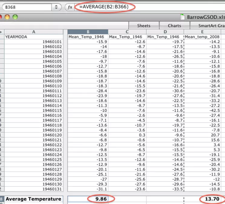
Step 6 – Calculate the Average Annual Temperature from Mean Daily Temperature Data
Column B of the Graphs sheet contains the mean (average) temperature for every day in 1946. Use Excel's AVERAGE function to calculate the average temperature in Barrow, Alaska for 1946.
In their simplest form, formulas in Excel consist of an equal sign (=) followed by a mathematical operation or FUNCTION. Most functions require additional parameters such as a range of cells.
- Scroll the Graphs sheet to the bottom of column B, the Mean_Temp_1946 field.
- In cell B367 enter the formula =AVERAGE(B2:B366). This formula calculates the average of the values in the cells from B2 to B366 and displays the result in the cell.
shows average cells at bottom of cols on graphs tab
Provenance: Rita Freuder, University of New Hampshire-Main Campus
Reuse: This item is offered under a Creative Commons Attribution-NonCommercial-ShareAlike license http://creativecommons.org/licenses/by-nc-sa/3.0/ You may reuse this item for non-commercial purposes as long as you provide attribution and offer any derivative works under a similar license.
- Press the Return or Enter key on your keyboard to display the calculated average temperature value.
Repeat this process to calculate the average temperature for 2010 in cell E367. (Hint: Use the same formula but substitute E for B.)
Based on your calculations, what is the difference in the average temperature in 1946 and 64 years later in 2010. Do these two averages suggest an overall trend in the average temperature in Barrow? How could you investigate whether a real trend exists?
The average temperature for 1946 is 9.9 degrees F and the average for 2010 is 14.6, a difference of 4.7 degrees 64 years apart. These two measurements are not sufficient to indicate a trend of increasing temperature. 1946 may have been a particularly cold year and 2010 an unusually warm year. To detect a trend, look at as many years of data as possible for that weather station. In Part 3, you will compare these annual averages over many years.
If you have trouble making graphs or finding averages in Excel, right-click (PC) or control-click (Mac) the barrow_part2_final.xls ( 4.5MB Jan17 11) link to download a complete Excel file.


