Part 3—Compare Processing Results
Step 1 – Create a Stack of Images
- Select File > Open, navigate to the Forests folder, and open all three images saved at the end of Part 2 (map1.tif, map2.tif, map3.tif).
- Choose Images > Stacks > Images to Stack to create a stack from these images. This process takes the three individual images and puts them into one image containing all three "slices" in a "stack" so that each one is on top of the other and can be moved through frame by frame or animated.

- The stack should look like this image. Notice the 1/3 in the upper left corner of the stack. This indicates that you are looking at the first of three images in a stack. The scroll bar below the image lets you navigate to other images in the stack.
- Use your mouse to click and drag the scroll bar across to change the image that you are looking at. In addition, you can move forward and backward through the stack using the Next Slice (>) and Previous Slice ( keyboard shortcuts.
- Observe each slice. How do the deforested areas (the bright white areas) change through time?
Step 2 – Create an RGB Color Composite Image from the Stack
It is possible to assign each image for each of the three years to a different color channel in order to use color to compare the specific changes in deforestation that have taken place from 1994 to 1995 to 1996.
- Use Image > Color > Stack to RGB to create an RGB (red, green, blue) color composite image from the stack.

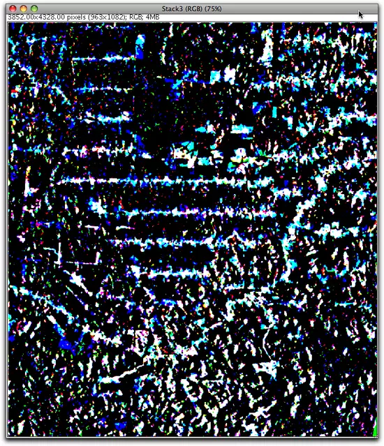
- The color composite image should look like this.

Step 3 – Interpret Results
To understand what each color on this final image means, first examine the figure below. Remember the concept of additive colors; red, green and blue are the three primary colors which together add up to make white.
As is clear from this figure:
Red + Green = Yellow
Red + Blue = Magenta
Green + Blue = Cyan
Red + Green + Blue = White
Red + Green = Yellow
Red + Blue = Magenta
Green + Blue = Cyan
Red + Green + Blue = White
- Make the 3-slice stack active again by clicking on it. The deforested areas appear as bright white in each slice of the stack.
- Arrange the image stack and the color composite image so that you can see both side by side.
- The color composite image you created is a combination of three individual images that are displayed in three primary colors.
The red areas are those that were bright white in the 1994 image.
The green areas are those that were bright white in the 1995 image.
The blue areas are those that were bright white in the 1994 image. - However, notice that in the color composite image, the four most prominent colors are black, white, cyan and blue.
Given how primary colors add together, what is your interpretation of what the colors mean on the color composite image?
- A careful look at the color composite image reveals that there are several white linear areas that have adjacent cyan and blue edges. What do think might be the reason for this pattern?


