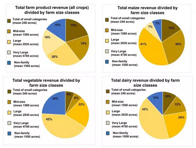


Figure 10.1.8b. Charts summarizing how the total revenue of farm products breaks down among farms of different size classes. Note that when all farm products are included in the estimates of revenue, there is a relatively even division of revenue among the farms of different size classes. However, the much larger numbers of farms in the small size category (88% of all farms, see figure 10.1.8a above) mean that the revenue <em>per farm</em> for these products is likely less. The graphs allow comparison of different products in terms of how different size classes of farms are participating in the markets for different types of products, e.g. "how do mid-size farms compare in the share of total revenue between maize and vegetables?"
Originally uploaded in Integrate:Teaching for Sustainability:InTeGrate Modules:Future of Food:Student Materials.
Image 174726 is a 530 by 700 pixel WebP
Uploaded:
Jan3 18