
Part 4—Prepare Data for Analysis
Step 1 – Explore U.S. County Population Data in Ohio to Consider Factors That Might Affect Surface Temperature
- Launch My World GIS by double-clicking its icon on your desktop or by clicking its icon in the dock (Mac) or Launch Bar (Win).
- Choose File > Open Project, and navigate to the file, Urban_Heat_Island_Part3.m3vz, that you either saved at the end of Part 3 or to the file that you downloaded at the end of Part 3. Select it and then click Open.
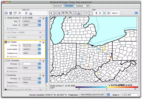
- When the project opens, the view is zoomed into Ohio and the following layers are in the Layer List:
- Globe Surface T 12 03 2008
- U.S. Cities > 50,000 (turned off)
- U.S. Cities (turned off)
- U.S. States
- U.S. Counties
- Countries
- MODIS_landsurf12_08.tiff (turned off)
- Turn off the Globe Surface T 12 03 2008 layer.
- Edit the appearance of the U.S. Counties layer to depict counties by population using a grayscale color gradient. On the U.S. Counties layer, click the drop-down menu next to Fill Color and select Population (2000). Notice that once you do this there is a legend for this layer at the bottom of the map.
- Turn on the Category List (legend of the layer) by clicking the L and selecting Name from the drop-down menu. The map will now also display the names of the counties.

- Make U.S. Counties the active layer. Then click on several counties with the Get Information Tool
 to discover names of the counties with the largest populations.


- Which county in Ohio has the largest population?

- Look at the map, how do the large cities compare with the most populous counties?
- What factors of large counties do you think will lead to increases in surface temperature?
Step 2 – Subset GLOBE Data to Create a New Surface Temperature Layer for Michigan, Ohio, and West Virginia
- Turn on and make the Globe Surface T 12 03 2008 layer active. Click the Show Table of the Active Layer button to explore the data in the layer. While exploring, consider the following questions:
- Where is the greatest concentration of schools reporting surface temperature data?
- How many different countries reported data for this day?
- Would it be valid to compare data from West Virginia to Trinidad and Tabago? Why or why not?
- What variables do we need to consider when comparing sites?

In the panel to the right, make the following choices:
- Select Records from: Globe Surface T 12 03 2008
- Whose: SP (state) Matches One Of The Values Checked Below. Check the boxes next to MI, OH, and WV.
- Check the box Make Selection a New Layer. Type "Surface Temp in MI, OH, WV" in the Result Name field. Click OK.


Step 3 – Select Short Grass Surface Cover Records From the MI, OH, WV Surface Temperature Layer

Comparing the surface temperatures on asphalt to grass would be like comparing the temperature of black versus white cars on a sunny day. Therefore, to make a scientific comparison it is necessary to limit the comparison to only one surface type that is common at schools: short grass. To do this, you will further subset the data, limiting it to only short grass cover.
- Click on the Analyze tab. In Analyze mode, choose Select...By Value.
In the panel to the right, make the following choices:
- Select Records from: Surf Temp in MI, OH, WV
- Whose: SCOV (surface cover) Matches One Of The Values Checked Below. Check the box next to "1"
- Do NOT check the box Make Selection a New Layer. Name the result "Short Grass". Click OK.
- The GLOBE records that are located in one of these three states and that also have a cover type of short grass have now been selected.


Step 4 – Create a 25-Kilometer Buffer Around U.S. Cities With a Population Greater Than 50,000
Imagine you are driving out of a large city and into the countryside. How far from the center of the city do you have to go until the landscape begins to change from urban to rural? Is this answer the same for every city? What data or imagery could help you identify that boundary? Aerial or satellite imagery could provide answers on the use of land. Both NASA and the USGS maintain the LANDSAT satellites that measure land use. Since there is no perfect answer for this distance, you will start by creating a 25-kilometer boundary, or buffer, around each of the selected cities with populations over 50,000.
- To make a buffer around a set of points, first click on the Analyze tab, scroll down the list of options, and then click on Make Buffer Around....
In the panel to the right, make the following choices:
- Create Buffer of: U.S. Cities > 50,000
- Set the buffer at 25 Kilometers (about 15.5 miles)
- Click the radio button for Dissolve All Buffers
- Name the result "25 km of Cities". Click OK.
- A new layer is created for the 25 km buffer, and displayed on the map as 25 km of Cities. Edit the appearance of the new layer to make the buffers transparent. Select the new 25 km layer by clicking on it, and then click on the Edit Appearance
 button just above the Layer List. In the window that opens, select the following options:
- Set Choose Fill Color by to Uniform and make it a pale orange
- Adjust the slider for Transparency to 70%
- Change the Outline Color to Orange
- Adjust Outline Width to a larger option
- Click Apply and Close.
- Visually compare the pattern of GLOBE surface temperature data with the 25 km buffer around U.S. Cities with a population over 50,000.
 The urban heat island effect is theorized to affect large cities that have converted a significant percentage of the natural vegetative cover to roads, parking lots, or buildings. Do you think there is a specific population level that is the definitive tipping point between cities that are affected by urban heat islands and those that are not? What population value would you choose? In what ways could even large cities combat excessive heat build-up through their planning or projects?
 - Click on Surface Temp in MI, OH, MW to make it active. In the layer name, under Highlight Mode, click the All (highlighting off) radio button. Then use the Pointer tool and click on the points on the map to investigate the temperature records inside and outside of the buffers. How do these temperatures compare?
- Save your project with a new name, such as "Urban_Heat_Island_Part_4".
- Quit My World GIS.


The EPA uses a population of 1 million in their examples for large cities and 50,000 was used as a starting point here. However, this study could be completed using various population levels. Urban heat island severity depends greatly on the amount of natural space preserved in an area, the use of green or living roofs, the use of concrete instead of asphalt for roads, as well as other factors which reduce the amount of absorbed energy.
If you had trouble with any of the steps of this part, such as sub-setting the GLOBE surface temperature data, limiting the cover to short grass, or creating the 25 kilometer buffer around the cities or if you simply need a fresh project file with all the data for the next part of the chapter, then use this project file. This file has been saved with all of the steps though the end of Part 4 completed.
Urban_Heat_Island_Part4.m3vz ( 3.5MB Jun2 10)
Right-click (PC) or control-click (Mac) the link above to download the file.
Urban_Heat_Island_Part4.m3vz ( 3.5MB Jun2 10)
Right-click (PC) or control-click (Mac) the link above to download the file.


