
Basic Graphing Skills
Related quantitative concepts: Understanding trends, Interpolation/Extrapolation, Functions, Graph Significance, Graphing confusion
Related quantitative concepts: Understanding trends, Interpola
Basic Graphing Skills
or skills we should have learned in high school
by Jennifer M. Wenner, Geology Department, University of Wisconsin-OshkoshJump down to: Plotting | Describing Graphs | Reading data | Examples and Exercises
Introductory textbooks are filled with graphs and plots. Graphs and plots are key in introductory courses in which quantitative skills are emphasized because they are the essence of giving students multiple representations of mathematical concepts; they can be expressed numerically, visually, and symbolically. Although concepts of plotting and graphing are taught throughout the K-12 curriculum, I find that within the first few lectures many students struggle with concepts. If this is the case, it may be necessary to review the basics of graphing or plotting.
Essential Concepts

Although they are certain to have experienced plots and graphs in high school, students often struggle with the basics of graphing. When I teach graphs, I find that there are five important concepts that I expect my students to be familiar with:
- What is a graph?
- constructing meaningful plots and graphs
- plotting x-y data on a graph
- describing plots or graphs
- reading and interpreting data from plots
What is a graph? Why are they so important?
Graphs play an important role in the modeling and understanding of complex natural systems and pop up in a number of places in the introductory geoscience curriculum. Although concepts of plotting and graphing are taught throughout grades K-12, I find that some students struggle - even with simple concepts that I would expect them to know. If this is the case in your course, it may be necessary to review the basics of graphing or plotting.

Helping students to construct a meaningful plot
I find that there are a number of incidences when introductory geoscience students have difficulty in constructing graphs and plots.
- Choosing the appropriate axis for a variable is difficult for some.
- Placing ordered pairs on the plot can cause anxiety for others
- Determining scale and labeling the axes with numbers presents difficulty for many
- First, what are we trying to represent here?
- Then, decide what the axes are...horizontal distance (in miles or km) on the x-axis and vertical relief (in feet or meters) on the y-axis.
- Next, determine the range of elevations present along the cross-section of interest
- Now, we need to determine the increments along the vertical scale. We can do that by thinking about several important things:
- What is the contour interval? Increments similar to contour interval may be helpful.
- How many possible increments are there on your paper?
- If the difference in elevation is 480 ft. and there are 10 increments on the plot, should you plot in increments of 48? Based on your contour interval, is this reasonable? Would it be easier to plot increments of 50?
- Finally, plot the elevations in the appropriate places on your graph and connect the dots with a SMOOTH curve.

Plotting data
Plotting ordered pairs on a Cartesian plot can be difficult for students even though it is likely that they have done it numerous times in their academic careers. The Teaching with Data module of Starting Point has some information (and links) describing good ways to teach students about plotting. Here are some important bits of information that can help faculty to make sure that students are up to speed on plotting:
- there are two axes - horizontal (often called the x-axis) and vertical (often called the y-axis),
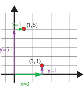
- a point on the graph is denoted by an ordered pair (or coordinates (e.g., (3,8)) where:
- the first number refers to horizontal position on the x-axis,
- the second number refers to vertical position on the y-axis,
- sometimes the ordered pairs are listed in tabular format with headings that correspond to the labels on the axis
- the two axes intersect at point called the origin with coordinates (0,0),
- the reason that we plot data is so that we can more easily observe trends or behavior of the data (modified from Anderson and Swanson, 2005)
Describing plots and graphs
Students struggle with the description of data on a plot. And, yet, that is generally the main reason that we use plots of data - to describe the data. Data can be described qualitatively using specific terminology:
- Often we use words that describe the curve or line made by the data: e.g., linear, exponential, asymptotic, periodic, etc.
- The strength of those relationships can also be characterized using words like strong, moderate or weak
- Sometimes we use words like increasing and decreasing or positive and negative to describe the relationship of a set of data.
For example: The data on the plot in the box below have a moderately strong negative linear relationship. Students may not have a strong picture of what those words mean, it may be necessary to explain this vocabulary (possibly using graphical and/or symbolic representation). Starting point has a discussion about how to help students with descriptions of data on graphs.

In addition to using qualitative terms, we can describe a plot using mathematical expressions. The most common (and one with which students are often familiar) is the equation for a line:
where m = slope and b = the y-intercept.
Students who are unfamiliar with the concept of plotting data on a graph may also have a difficult time with the mathematics of describing trends and data. Once students have mastered the descriptive vocabulary trends/data, they may need additional help with the more complex concepts involved in mathematical description of trends. See the Understanding Trends page for more information about mathematical interpretation of trends.
Reading data from graphs
Plots of data (and simple relationships between variables) can help geoscientists to understand and predict the physical way that the Earth works. Plotting known data can help us to visualize the behavior of systems in situations that have not been measured. Students in introductory geoscience courses are expected to be able to read data from plots of lines (or sometimes more complex mathematical relationships like curves) to predict behavior. If students have an understanding of the concepts discussed above, they should be able to generate new data from plots of known data. An example of using plots to predict behavior is presented in the forecasting sections of SERC's floods and flooding page.
Geologists use graphs in a variety of simple ways that nearly any student can comprehend. Graphs can be a visual way of predicting or forecasting geologic events. But they are also used to understand the behavior of systems, to visualize large sets of data and to help geologists understand many important systems that might not be easy to understand just by looking at a bunch of numbers. Graphs are a way of making scores of data points manageable and, often, more understandable.
More advanced graphing skills
The skills discussed above are basic skills that are essential for many of the applications in introductory geoscience courses. Some introductory geoscience topics require more advanced skills and may take a greater effort to get your students up to speed. There are a number of pages on the Teaching Quantitative Skills web site that are geared toward these skills:
- Understanding trends in data
- Interpolation/extrapolation of trends
- Generation of functions from graphs/data
Teaching Examples and Exercises
-
Plotting Data
A module at Starting Point designed to give faculty help with teaching students about plotting data on graphs. Each link gives some information about the important points for plotting points on graphs. -
Describing Graphs
Starting Point has this module about describing graphs with a number of good links for both faculty and students. As with the Plotting module, there are a number of useful links to web pages that address student difficulty with describing graphs. -
Activities designed to increase and develop quantitative skills
A number of the activities posted on the Quantitative Skills in the Geosciences site are designed to help students learn about graphing in a geoscience context. Some of these activities are designed for upper level students. -
Introductory level activities involving Excel
There are dozens of activities that involve the use of Excel that are available as a part of SERC's Starting Point. Each of these activities is downloadable and ready to use. -
ConcepTests involving intepretation of graphs
There are a number of examples of ConcepTests that can be used to break up lecture in a large classroom. Each of these ConcepTests involves the interpretation of graphs appropriate to introductory level geoscience.
Resources
- Lee Marek at University of Illinois Chicago has a graphing rules page with information for students about how to graph a data set.
-
Mathworld has a complex definition of graph with links to multiple types of graphs.
-
The Center for Support of Teaching and Learning at Syracuse University has two tutorials for students that covers the visual display of information on graphs.