Download and open the NWS Monthly Precipitation Data.kmz (KMZ File 212kB Jul21 08) file in Google Earth.
In the Layers list in Google Earth, click the arrow next to the NWS layer to reveal the list of sub-layers. Start by un-checking the boxes to turn off all the sub-layers except for January 2008 Precipitation.
Use the information in the two sections below to walk you through interpreting the two different types of images in the file. NOTE: The file you downloaded shows data images for the Spring of 2008. To view web-based images of current data, go to the Advanced Hydrologic Prediction Service: Precipitation.
Interpreting Precipitation Images
Turn on the January 2008 Precipitation layer. Use the color scale on the right to interpret the map colors.
- On the map, look at the area where you live to see what color it is. Check where that color is on the scale.
- Find an area on the map that is a different color. Check that color on the scale to see if the second location received more or less rain than your area.
- Check carefully to find areas on the map that had the most and least precipitation.
- After you've worked on understanding the patterns, check your interpretation by revealing the example interpretation below.
Un-check the box to the left of the name of the January Precipitation layer.
Interpreting Departure from Normal Precipitation Images
The National Weather Service also produces Departure from Normal Precipitation images. These show if areas had more or less precipitation than normal for the month.
Turn on the January 2008 Departure from Normal Precipitation layer. Use the color scale on the right to interpret the map colors.
- Check carefully to find areas on the map that had more and less than normal precipitation.
- After you've worked on understanding the patterns, check your interpretation by revealing the example interpretation below.
Stop and Think
5. Which areas in the continental U.S. consistently received less precipitation than normal during January 2008?
6. Based on your explorations, describe the locations that you think were developing or experiencing drought by June of 2008.
- Once you're confident that you can make meaning of the colorful images, one of the image sublayers at a time. Check the precipitation amount and departure from normal for your own location and look for areas that received less precipitation than normal.
- Return to the Advanced Hydrologic Prediction Service: Precipitation page. Turn on the Map Overlay for River Forecast Center boundaries.
- Explore the data across the contiguous United States, and within a region of interest. Choose for example, an area near your home, or in an area of known drought.
- Look at the 7-day, 30-day, and year-to-date maps. Switch between the Observed, Normal, and Departure from Normal maps. Look for areas that may be currently experiencing meteorological drought conditions.
Reduced streamflow
The United States Geologic Survey (USGS) provides streamflow data from gauging stations across the country. At each station, instruments estimate the downstream flow of water and use wireless communication devices to submit the information to central locations. Flow rates are classified according to historical records so you can tell at a glance of a stream is above, at, or below normal levels.
- Go to USGS Waterwatch Google Earth Streamflow
- On the page that opens, choose Streamgages, colored by streamflow condition (390K). It is the first link in the list.
- Choose the KMZ file, real_us.kmz, that is re-created every hour.
If necessary, open the real_us.kmz file in Google Earth. Turn the layer on by clicking in the checkbox to the left of its name. Click the arrow to the left of the check box to reveal the various layers of the streamflow data. Checking In
From the legend, which colors indicate gauging stations that are reporting low streamflows?
Red, dark red, and orange indicate lowest streamflow (dry conditions).
Which regions of the United States show below normal (or dry) streamflows?
Answers will vary. Areas that show many red, dark red, and orange dots have low streamflow.
Use the check boxes in the legend to turn off the streams that are normal or higher or not ranked. You will have 3 sets of gauges remaining on your map. They represent rivers and streams where the flow is below the 25th percentile of normal flow for that day of the year.
Stop and Think
7. If an area shows just one stream gage location with lower-than-normal streamflow, can you assume that the area is in drought? Why or why not? Describe one or more conditions besides drought that could account for low streamflow.
8. Based on patterns in the streamflow data, predict which areas of the country are experiencing drought.
Compare your predictions to the Drought Monitor
- Go to the Drought Monitor Data Download page to retrieve the KMZ data layer that shows current drought conditions.
- Right-click or Control-click (Mac) on the KMZ link next to "Current"
- Choose the "Save Link As..." command in your browser
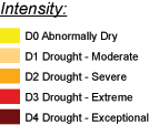
Use this legend to interpret the Drought Monitor map.
- In Google Earth, choose File >Open, and browse to the location where you stored the file. Turn the layer on and click the toggle (arrow) to reveal the sub-layers of data.
- You can find detailed information about the drought categories in the map from the National Drought Monitor Center where the maps are produced.
- To focus in on the areas where drought is severe, extreme, or exceptional, turn off the drought index layers that are less than D2.
- Compare the areas of drought with the predictions you made based on precipitation and streamflow.
Stop and Think
9. How well did your predictions match the drought monitor map? Describe areas where your predictions were correct and areas where they did not match.
10. Of the two main types of data you examined—precipitation and the streamflow—which of the two seems to be a better predictor of drought conditions identified by the Drought Monitor layer?